@charset "UTF-8";
@import url("https://fonts.googleapis.com/css2?family=Noto+Sans+JP:wght@400;700&family=Ubuntu:wght@400;700&display=swap");
@import url("https://fonts.googleapis.com/css?family=Ubuntu+Condensed");
html {
  box-sizing: border-box;
  font-family: sans-serif;
  line-height: 1.15;
  -webkit-text-size-adjust: 100%;
  -ms-text-size-adjust: 100%;
  -ms-overflow-style: scrollbar;
  -webkit-tap-highlight-color: rgba(0, 0, 0, 0); }

*,
*::before,
*::after {
  box-sizing: inherit; }

@-ms-viewport {
  width: device-width; }
article, aside, dialog, figcaption, figure, footer, header, hgroup, main, nav, section {
  display: block; }

body {
  margin: 0;
  font-family: "Ubuntu", "Noto Sans JP", sans-serif;
  font-size: 1rem;
  font-weight: 400;
  line-height: 1.5;
  color: #212529;
  background-color: #fff;
  width: 100%;
  overflow-x: hidden; }

[tabindex="-1"]:focus {
  outline: none !important; }

hr {
  box-sizing: content-box;
  height: 0;
  overflow: visible; }

h1, h2, h3, h4, h5, h6 {
  margin-top: 0;
  margin-bottom: .5rem; }

p {
  margin-top: 0;
  margin-bottom: 1rem; }

abbr[title],
abbr[data-original-title] {
  text-decoration: underline;
  text-decoration: underline dotted;
  cursor: help;
  border-bottom: 0; }

address {
  margin-bottom: 1rem;
  font-style: normal;
  line-height: inherit; }

ol,
ul,
dl {
  margin-top: 0;
  margin-bottom: 1rem; }

ol ol,
ul ul,
ol ul,
ul ol {
  margin-bottom: 0; }

dt {
  font-weight: 700; }

dd {
  margin-bottom: .5rem;
  margin-left: 0; }

blockquote {
  margin: 0 0 1rem; }

dfn {
  font-style: italic; }

b,
strong {
  font-weight: bolder; }

small {
  font-size: 80%; }

sub,
sup {
  position: relative;
  font-size: 75%;
  line-height: 0;
  vertical-align: baseline; }

sub {
  bottom: -.25em; }

sup {
  top: -.5em; }

a {
  color: theme-color("primary");
  text-decoration: none;
  background-color: transparent;
  -webkit-text-decoration-skip: objects; }
  a:hover {
    color: theme-color("primary");
    text-decoration: underline; }

a:not([href]):not([tabindex]) {
  color: inherit;
  text-decoration: none; }
  a:not([href]):not([tabindex]):hover, a:not([href]):not([tabindex]):focus {
    color: inherit;
    text-decoration: none; }
  a:not([href]):not([tabindex]):focus {
    outline: 0; }

pre,
code,
kbd,
samp {
  font-family: monospace, monospace;
  font-size: 1em; }

pre {
  margin-top: 0;
  margin-bottom: 1rem;
  overflow: auto; }

figure {
  margin: 0 0 1rem; }

img {
  vertical-align: middle;
  border-style: none;
  max-width: 100%;
  width: auto; }

svg:not(:root) {
  overflow: hidden; }

a,
area,
button,
[role="button"],
input,
label,
select,
summary,
textarea {
  touch-action: manipulation; }

table {
  border-collapse: collapse; }

caption {
  padding-top: 0.75rem;
  padding-bottom: 0.75rem;
  color: #212529;
  text-align: left;
  caption-side: bottom; }

th {
  text-align: left; }

label {
  display: inline-block;
  margin-bottom: .5rem; }

button:focus {
  outline: 1px dotted;
  outline: 5px auto -webkit-focus-ring-color; }

input,
button,
select,
optgroup,
textarea {
  margin: 0;
  font-family: inherit;
  font-size: inherit;
  line-height: inherit; }

button,
input {
  overflow: visible; }

button,
select {
  text-transform: none; }

button,
html [type="button"],
[type="reset"],
[type="submit"] {
  -webkit-appearance: button; }

button::-moz-focus-inner,
[type="button"]::-moz-focus-inner,
[type="reset"]::-moz-focus-inner,
[type="submit"]::-moz-focus-inner {
  padding: 0;
  border-style: none; }

input[type="radio"],
input[type="checkbox"] {
  box-sizing: border-box;
  padding: 0; }

input[type="date"],
input[type="time"],
input[type="datetime-local"],
input[type="month"] {
  -webkit-appearance: listbox; }

textarea {
  overflow: auto;
  resize: vertical; }

fieldset {
  min-width: 0;
  padding: 0;
  margin: 0;
  border: 0; }

legend {
  display: block;
  width: 100%;
  max-width: 100%;
  padding: 0;
  margin-bottom: .5rem;
  font-size: 1.5rem;
  line-height: inherit;
  color: inherit;
  white-space: normal; }

progress {
  vertical-align: baseline; }

[type="number"]::-webkit-inner-spin-button,
[type="number"]::-webkit-outer-spin-button {
  height: auto; }

[type="search"] {
  outline-offset: -2px;
  -webkit-appearance: none; }

[type="search"]::-webkit-search-cancel-button,
[type="search"]::-webkit-search-decoration {
  -webkit-appearance: none; }

::-webkit-file-upload-button {
  font: inherit;
  -webkit-appearance: button; }

output {
  display: inline-block; }

summary {
  display: list-item; }

template {
  display: none; }

[hidden] {
  display: none !important; }

.l-container,
.l-section__inner {
  position: relative;
  width: 100%;
  margin-right: auto;
  margin-left: auto; }
  @media (min-width: 576px) {
    .l-container,
    .l-section__inner {
      max-width: 540px; } }
  @media (min-width: 768px) {
    .l-container,
    .l-section__inner {
      max-width: 720px; } }
  @media (min-width: 992px) {
    .l-container,
    .l-section__inner {
      max-width: 960px; } }
  @media (min-width: 1200px) {
    .l-container,
    .l-section__inner {
      max-width: 1140px; } }
  @media (min-width: 1540px) {
    .l-container,
    .l-section__inner {
      max-width: 1480px; } }

.l-container--fluid {
  position: relative;
  width: 100%;
  margin-right: auto;
  margin-left: auto; }

.l-row {
  display: flex;
  flex-wrap: wrap;
  margin-right: -12px;
  margin-left: -12px; }

.no-gutters {
  margin-right: 0;
  margin-left: 0; }
  .no-gutters > .l-col,
  .no-gutters > [class*="l-col-"] {
    padding-right: 0;
    padding-left: 0; }

.l-col-1, .l-col-2, .l-col-3, .l-col-4, .l-col-5, .l-col-6, .l-col-7, .l-col-8, .l-col-9, .l-col-10, .l-col-11, .l-col-12, .l-col,
.l-col-auto, .l-col-sm-1, .l-col-sm-2, .l-col-sm-3, .l-col-sm-4, .l-col-sm-5, .l-col-sm-6, .l-col-sm-7, .l-col-sm-8, .l-col-sm-9, .l-col-sm-10, .l-col-sm-11, .l-col-sm-12, .l-col-sm,
.l-col-sm-auto, .l-col-md-1, .l-col-md-2, .l-col-md-3, .l-col-md-4, .l-col-md-5, .l-col-md-6, .l-col-md-7, .l-col-md-8, .l-col-md-9, .l-col-md-10, .l-col-md-11, .l-col-md-12, .l-col-md,
.l-col-md-auto, .l-col-lg-1, .l-col-lg-2, .l-col-lg-3, .l-col-lg-4, .l-col-lg-5, .l-col-lg-6, .l-col-lg-7, .l-col-lg-8, .l-col-lg-9, .l-col-lg-10, .l-col-lg-11, .l-col-lg-12, .l-col-lg,
.l-col-lg-auto, .l-col-xl-1, .l-col-xl-2, .l-col-xl-3, .l-col-xl-4, .l-col-xl-5, .l-col-xl-6, .l-col-xl-7, .l-col-xl-8, .l-col-xl-9, .l-col-xl-10, .l-col-xl-11, .l-col-xl-12, .l-col-xl,
.l-col-xl-auto, .l-col-xxl-1, .l-col-xxl-2, .l-col-xxl-3, .l-col-xxl-4, .l-col-xxl-5, .l-col-xxl-6, .l-col-xxl-7, .l-col-xxl-8, .l-col-xxl-9, .l-col-xxl-10, .l-col-xxl-11, .l-col-xxl-12, .l-col-xxl,
.l-col-xxl-auto {
  position: relative;
  width: 100%;
  min-height: 1px;
  padding-right: 12px;
  padding-left: 12px; }

.l-col {
  flex-basis: 0;
  flex-grow: 1;
  max-width: 100%; }

.l-col-auto {
  flex: 0 0 auto;
  width: auto;
  max-width: none; }

.l-col-1 {
  flex: 0 0 8.3333333333%;
  max-width: 8.3333333333%; }

.l-col-2 {
  flex: 0 0 16.6666666667%;
  max-width: 16.6666666667%; }

.l-col-3 {
  flex: 0 0 25%;
  max-width: 25%; }

.l-col-4 {
  flex: 0 0 33.3333333333%;
  max-width: 33.3333333333%; }

.l-col-5 {
  flex: 0 0 41.6666666667%;
  max-width: 41.6666666667%; }

.l-col-6 {
  flex: 0 0 50%;
  max-width: 50%; }

.l-col-7 {
  flex: 0 0 58.3333333333%;
  max-width: 58.3333333333%; }

.l-col-8 {
  flex: 0 0 66.6666666667%;
  max-width: 66.6666666667%; }

.l-col-9 {
  flex: 0 0 75%;
  max-width: 75%; }

.l-col-10 {
  flex: 0 0 83.3333333333%;
  max-width: 83.3333333333%; }

.l-col-11 {
  flex: 0 0 91.6666666667%;
  max-width: 91.6666666667%; }

.l-col-12 {
  flex: 0 0 100%;
  max-width: 100%; }

.l-order-first {
  order: -1; }

.l-order-1 {
  order: 1; }

.l-order-2 {
  order: 2; }

.l-order-3 {
  order: 3; }

.l-order-4 {
  order: 4; }

.l-order-5 {
  order: 5; }

.l-order-6 {
  order: 6; }

.l-order-7 {
  order: 7; }

.l-order-8 {
  order: 8; }

.l-order-9 {
  order: 9; }

.l-order-10 {
  order: 10; }

.l-order-11 {
  order: 11; }

.l-order-12 {
  order: 12; }

.l-offset-1 {
  margin-left: 8.3333333333%; }

.l-offset-2 {
  margin-left: 16.6666666667%; }

.l-offset-3 {
  margin-left: 25%; }

.l-offset-4 {
  margin-left: 33.3333333333%; }

.l-offset-5 {
  margin-left: 41.6666666667%; }

.l-offset-6 {
  margin-left: 50%; }

.l-offset-7 {
  margin-left: 58.3333333333%; }

.l-offset-8 {
  margin-left: 66.6666666667%; }

.l-offset-9 {
  margin-left: 75%; }

.l-offset-10 {
  margin-left: 83.3333333333%; }

.l-offset-11 {
  margin-left: 91.6666666667%; }

@media (min-width: 576px) {
  .l-col-sm {
    flex-basis: 0;
    flex-grow: 1;
    max-width: 100%; }

  .l-col-sm-auto {
    flex: 0 0 auto;
    width: auto;
    max-width: none; }

  .l-col-sm-1 {
    flex: 0 0 8.3333333333%;
    max-width: 8.3333333333%; }

  .l-col-sm-2 {
    flex: 0 0 16.6666666667%;
    max-width: 16.6666666667%; }

  .l-col-sm-3 {
    flex: 0 0 25%;
    max-width: 25%; }

  .l-col-sm-4 {
    flex: 0 0 33.3333333333%;
    max-width: 33.3333333333%; }

  .l-col-sm-5 {
    flex: 0 0 41.6666666667%;
    max-width: 41.6666666667%; }

  .l-col-sm-6 {
    flex: 0 0 50%;
    max-width: 50%; }

  .l-col-sm-7 {
    flex: 0 0 58.3333333333%;
    max-width: 58.3333333333%; }

  .l-col-sm-8 {
    flex: 0 0 66.6666666667%;
    max-width: 66.6666666667%; }

  .l-col-sm-9 {
    flex: 0 0 75%;
    max-width: 75%; }

  .l-col-sm-10 {
    flex: 0 0 83.3333333333%;
    max-width: 83.3333333333%; }

  .l-col-sm-11 {
    flex: 0 0 91.6666666667%;
    max-width: 91.6666666667%; }

  .l-col-sm-12 {
    flex: 0 0 100%;
    max-width: 100%; }

  .l-order-sm-first {
    order: -1; }

  .l-order-sm-1 {
    order: 1; }

  .l-order-sm-2 {
    order: 2; }

  .l-order-sm-3 {
    order: 3; }

  .l-order-sm-4 {
    order: 4; }

  .l-order-sm-5 {
    order: 5; }

  .l-order-sm-6 {
    order: 6; }

  .l-order-sm-7 {
    order: 7; }

  .l-order-sm-8 {
    order: 8; }

  .l-order-sm-9 {
    order: 9; }

  .l-order-sm-10 {
    order: 10; }

  .l-order-sm-11 {
    order: 11; }

  .l-order-sm-12 {
    order: 12; }

  .l-offset-sm-0 {
    margin-left: 0; }

  .l-offset-sm-1 {
    margin-left: 8.3333333333%; }

  .l-offset-sm-2 {
    margin-left: 16.6666666667%; }

  .l-offset-sm-3 {
    margin-left: 25%; }

  .l-offset-sm-4 {
    margin-left: 33.3333333333%; }

  .l-offset-sm-5 {
    margin-left: 41.6666666667%; }

  .l-offset-sm-6 {
    margin-left: 50%; }

  .l-offset-sm-7 {
    margin-left: 58.3333333333%; }

  .l-offset-sm-8 {
    margin-left: 66.6666666667%; }

  .l-offset-sm-9 {
    margin-left: 75%; }

  .l-offset-sm-10 {
    margin-left: 83.3333333333%; }

  .l-offset-sm-11 {
    margin-left: 91.6666666667%; } }
@media (min-width: 768px) {
  .l-col-md {
    flex-basis: 0;
    flex-grow: 1;
    max-width: 100%; }

  .l-col-md-auto {
    flex: 0 0 auto;
    width: auto;
    max-width: none; }

  .l-col-md-1 {
    flex: 0 0 8.3333333333%;
    max-width: 8.3333333333%; }

  .l-col-md-2 {
    flex: 0 0 16.6666666667%;
    max-width: 16.6666666667%; }

  .l-col-md-3 {
    flex: 0 0 25%;
    max-width: 25%; }

  .l-col-md-4 {
    flex: 0 0 33.3333333333%;
    max-width: 33.3333333333%; }

  .l-col-md-5 {
    flex: 0 0 41.6666666667%;
    max-width: 41.6666666667%; }

  .l-col-md-6 {
    flex: 0 0 50%;
    max-width: 50%; }

  .l-col-md-7 {
    flex: 0 0 58.3333333333%;
    max-width: 58.3333333333%; }

  .l-col-md-8 {
    flex: 0 0 66.6666666667%;
    max-width: 66.6666666667%; }

  .l-col-md-9 {
    flex: 0 0 75%;
    max-width: 75%; }

  .l-col-md-10 {
    flex: 0 0 83.3333333333%;
    max-width: 83.3333333333%; }

  .l-col-md-11 {
    flex: 0 0 91.6666666667%;
    max-width: 91.6666666667%; }

  .l-col-md-12 {
    flex: 0 0 100%;
    max-width: 100%; }

  .l-order-md-first {
    order: -1; }

  .l-order-md-1 {
    order: 1; }

  .l-order-md-2 {
    order: 2; }

  .l-order-md-3 {
    order: 3; }

  .l-order-md-4 {
    order: 4; }

  .l-order-md-5 {
    order: 5; }

  .l-order-md-6 {
    order: 6; }

  .l-order-md-7 {
    order: 7; }

  .l-order-md-8 {
    order: 8; }

  .l-order-md-9 {
    order: 9; }

  .l-order-md-10 {
    order: 10; }

  .l-order-md-11 {
    order: 11; }

  .l-order-md-12 {
    order: 12; }

  .l-offset-md-0 {
    margin-left: 0; }

  .l-offset-md-1 {
    margin-left: 8.3333333333%; }

  .l-offset-md-2 {
    margin-left: 16.6666666667%; }

  .l-offset-md-3 {
    margin-left: 25%; }

  .l-offset-md-4 {
    margin-left: 33.3333333333%; }

  .l-offset-md-5 {
    margin-left: 41.6666666667%; }

  .l-offset-md-6 {
    margin-left: 50%; }

  .l-offset-md-7 {
    margin-left: 58.3333333333%; }

  .l-offset-md-8 {
    margin-left: 66.6666666667%; }

  .l-offset-md-9 {
    margin-left: 75%; }

  .l-offset-md-10 {
    margin-left: 83.3333333333%; }

  .l-offset-md-11 {
    margin-left: 91.6666666667%; } }
@media (min-width: 992px) {
  .l-col-lg {
    flex-basis: 0;
    flex-grow: 1;
    max-width: 100%; }

  .l-col-lg-auto {
    flex: 0 0 auto;
    width: auto;
    max-width: none; }

  .l-col-lg-1 {
    flex: 0 0 8.3333333333%;
    max-width: 8.3333333333%; }

  .l-col-lg-2 {
    flex: 0 0 16.6666666667%;
    max-width: 16.6666666667%; }

  .l-col-lg-3 {
    flex: 0 0 25%;
    max-width: 25%; }

  .l-col-lg-4 {
    flex: 0 0 33.3333333333%;
    max-width: 33.3333333333%; }

  .l-col-lg-5 {
    flex: 0 0 41.6666666667%;
    max-width: 41.6666666667%; }

  .l-col-lg-6 {
    flex: 0 0 50%;
    max-width: 50%; }

  .l-col-lg-7 {
    flex: 0 0 58.3333333333%;
    max-width: 58.3333333333%; }

  .l-col-lg-8 {
    flex: 0 0 66.6666666667%;
    max-width: 66.6666666667%; }

  .l-col-lg-9 {
    flex: 0 0 75%;
    max-width: 75%; }

  .l-col-lg-10 {
    flex: 0 0 83.3333333333%;
    max-width: 83.3333333333%; }

  .l-col-lg-11 {
    flex: 0 0 91.6666666667%;
    max-width: 91.6666666667%; }

  .l-col-lg-12 {
    flex: 0 0 100%;
    max-width: 100%; }

  .l-order-lg-first {
    order: -1; }

  .l-order-lg-1 {
    order: 1; }

  .l-order-lg-2 {
    order: 2; }

  .l-order-lg-3 {
    order: 3; }

  .l-order-lg-4 {
    order: 4; }

  .l-order-lg-5 {
    order: 5; }

  .l-order-lg-6 {
    order: 6; }

  .l-order-lg-7 {
    order: 7; }

  .l-order-lg-8 {
    order: 8; }

  .l-order-lg-9 {
    order: 9; }

  .l-order-lg-10 {
    order: 10; }

  .l-order-lg-11 {
    order: 11; }

  .l-order-lg-12 {
    order: 12; }

  .l-offset-lg-0 {
    margin-left: 0; }

  .l-offset-lg-1 {
    margin-left: 8.3333333333%; }

  .l-offset-lg-2 {
    margin-left: 16.6666666667%; }

  .l-offset-lg-3 {
    margin-left: 25%; }

  .l-offset-lg-4 {
    margin-left: 33.3333333333%; }

  .l-offset-lg-5 {
    margin-left: 41.6666666667%; }

  .l-offset-lg-6 {
    margin-left: 50%; }

  .l-offset-lg-7 {
    margin-left: 58.3333333333%; }

  .l-offset-lg-8 {
    margin-left: 66.6666666667%; }

  .l-offset-lg-9 {
    margin-left: 75%; }

  .l-offset-lg-10 {
    margin-left: 83.3333333333%; }

  .l-offset-lg-11 {
    margin-left: 91.6666666667%; } }
@media (min-width: 1200px) {
  .l-col-xl {
    flex-basis: 0;
    flex-grow: 1;
    max-width: 100%; }

  .l-col-xl-auto {
    flex: 0 0 auto;
    width: auto;
    max-width: none; }

  .l-col-xl-1 {
    flex: 0 0 8.3333333333%;
    max-width: 8.3333333333%; }

  .l-col-xl-2 {
    flex: 0 0 16.6666666667%;
    max-width: 16.6666666667%; }

  .l-col-xl-3 {
    flex: 0 0 25%;
    max-width: 25%; }

  .l-col-xl-4 {
    flex: 0 0 33.3333333333%;
    max-width: 33.3333333333%; }

  .l-col-xl-5 {
    flex: 0 0 41.6666666667%;
    max-width: 41.6666666667%; }

  .l-col-xl-6 {
    flex: 0 0 50%;
    max-width: 50%; }

  .l-col-xl-7 {
    flex: 0 0 58.3333333333%;
    max-width: 58.3333333333%; }

  .l-col-xl-8 {
    flex: 0 0 66.6666666667%;
    max-width: 66.6666666667%; }

  .l-col-xl-9 {
    flex: 0 0 75%;
    max-width: 75%; }

  .l-col-xl-10 {
    flex: 0 0 83.3333333333%;
    max-width: 83.3333333333%; }

  .l-col-xl-11 {
    flex: 0 0 91.6666666667%;
    max-width: 91.6666666667%; }

  .l-col-xl-12 {
    flex: 0 0 100%;
    max-width: 100%; }

  .l-order-xl-first {
    order: -1; }

  .l-order-xl-1 {
    order: 1; }

  .l-order-xl-2 {
    order: 2; }

  .l-order-xl-3 {
    order: 3; }

  .l-order-xl-4 {
    order: 4; }

  .l-order-xl-5 {
    order: 5; }

  .l-order-xl-6 {
    order: 6; }

  .l-order-xl-7 {
    order: 7; }

  .l-order-xl-8 {
    order: 8; }

  .l-order-xl-9 {
    order: 9; }

  .l-order-xl-10 {
    order: 10; }

  .l-order-xl-11 {
    order: 11; }

  .l-order-xl-12 {
    order: 12; }

  .l-offset-xl-0 {
    margin-left: 0; }

  .l-offset-xl-1 {
    margin-left: 8.3333333333%; }

  .l-offset-xl-2 {
    margin-left: 16.6666666667%; }

  .l-offset-xl-3 {
    margin-left: 25%; }

  .l-offset-xl-4 {
    margin-left: 33.3333333333%; }

  .l-offset-xl-5 {
    margin-left: 41.6666666667%; }

  .l-offset-xl-6 {
    margin-left: 50%; }

  .l-offset-xl-7 {
    margin-left: 58.3333333333%; }

  .l-offset-xl-8 {
    margin-left: 66.6666666667%; }

  .l-offset-xl-9 {
    margin-left: 75%; }

  .l-offset-xl-10 {
    margin-left: 83.3333333333%; }

  .l-offset-xl-11 {
    margin-left: 91.6666666667%; } }
@media (min-width: 1540px) {
  .l-col-xxl {
    flex-basis: 0;
    flex-grow: 1;
    max-width: 100%; }

  .l-col-xxl-auto {
    flex: 0 0 auto;
    width: auto;
    max-width: none; }

  .l-col-xxl-1 {
    flex: 0 0 8.3333333333%;
    max-width: 8.3333333333%; }

  .l-col-xxl-2 {
    flex: 0 0 16.6666666667%;
    max-width: 16.6666666667%; }

  .l-col-xxl-3 {
    flex: 0 0 25%;
    max-width: 25%; }

  .l-col-xxl-4 {
    flex: 0 0 33.3333333333%;
    max-width: 33.3333333333%; }

  .l-col-xxl-5 {
    flex: 0 0 41.6666666667%;
    max-width: 41.6666666667%; }

  .l-col-xxl-6 {
    flex: 0 0 50%;
    max-width: 50%; }

  .l-col-xxl-7 {
    flex: 0 0 58.3333333333%;
    max-width: 58.3333333333%; }

  .l-col-xxl-8 {
    flex: 0 0 66.6666666667%;
    max-width: 66.6666666667%; }

  .l-col-xxl-9 {
    flex: 0 0 75%;
    max-width: 75%; }

  .l-col-xxl-10 {
    flex: 0 0 83.3333333333%;
    max-width: 83.3333333333%; }

  .l-col-xxl-11 {
    flex: 0 0 91.6666666667%;
    max-width: 91.6666666667%; }

  .l-col-xxl-12 {
    flex: 0 0 100%;
    max-width: 100%; }

  .l-order-xxl-first {
    order: -1; }

  .l-order-xxl-1 {
    order: 1; }

  .l-order-xxl-2 {
    order: 2; }

  .l-order-xxl-3 {
    order: 3; }

  .l-order-xxl-4 {
    order: 4; }

  .l-order-xxl-5 {
    order: 5; }

  .l-order-xxl-6 {
    order: 6; }

  .l-order-xxl-7 {
    order: 7; }

  .l-order-xxl-8 {
    order: 8; }

  .l-order-xxl-9 {
    order: 9; }

  .l-order-xxl-10 {
    order: 10; }

  .l-order-xxl-11 {
    order: 11; }

  .l-order-xxl-12 {
    order: 12; }

  .l-offset-xxl-0 {
    margin-left: 0; }

  .l-offset-xxl-1 {
    margin-left: 8.3333333333%; }

  .l-offset-xxl-2 {
    margin-left: 16.6666666667%; }

  .l-offset-xxl-3 {
    margin-left: 25%; }

  .l-offset-xxl-4 {
    margin-left: 33.3333333333%; }

  .l-offset-xxl-5 {
    margin-left: 41.6666666667%; }

  .l-offset-xxl-6 {
    margin-left: 50%; }

  .l-offset-xxl-7 {
    margin-left: 58.3333333333%; }

  .l-offset-xxl-8 {
    margin-left: 66.6666666667%; }

  .l-offset-xxl-9 {
    margin-left: 75%; }

  .l-offset-xxl-10 {
    margin-left: 83.3333333333%; }

  .l-offset-xxl-11 {
    margin-left: 91.6666666667%; } }
.gn {
  position: fixed;
  top: 0;
  left: 0;
  z-index: 1000;
  width: 100%;
  transition: .3s; }
  .gn__content {
    position: relative;
    width: 100%;
    margin-right: auto;
    margin-left: auto; }
    @media (min-width: 576px) {
      .gn__content {
        max-width: 540px; } }
    @media (min-width: 768px) {
      .gn__content {
        max-width: 720px; } }
    @media (min-width: 992px) {
      .gn__content {
        max-width: 960px; } }
    @media (min-width: 1200px) {
      .gn__content {
        max-width: 1140px; } }
    @media (min-width: 1540px) {
      .gn__content {
        max-width: 1480px; } }
  .gn__logo {
    display: inline-block;
    margin-bottom: 0;
    font-size: 1.5rem;
    line-height: 1.5rem; }
  .gn__menu__list {
    margin-bottom: 0; }
  .gn.is-scroll {
    transition: .3s;
    background-color: rgba(255, 68, 70, 0.8); }
    .gn.is-scroll.headercolor--aboutus {
      background-color: rgba(255, 155, 20, 0.8); }
    .gn.is-scroll.headercolor--service {
      background-color: rgba(13, 183, 59, 0.8); }
    .gn.is-scroll.headercolor--media {
      background-color: rgba(65, 123, 228, 0.8); }
    .gn.is-scroll.headercolor--recruit {
      background-color: rgba(83, 64, 195, 0.8); }
    .gn.is-scroll.headercolor--contact {
      background-color: rgba(254, 77, 118, 0.8); }
  .gn.is-open {
    transition: .3s;
    background: #FF4446; }
    .gn.is-open.headercolor--aboutus {
      background: #FF9B14; }
    .gn.is-open.headercolor--service {
      background: #0DB73B; }
    .gn.is-open.headercolor--media {
      background: #417BE4; }
    .gn.is-open.headercolor--recruit {
      background: #5340C3; }
    .gn.is-open.headercolor--contact {
      background: #FE4D76; }
  .gn.is-home {
    background: linear-gradient(90deg, #FF4446, #ffa044) fixed; }
  .gn.is-about {
    background: linear-gradient(90deg, #FF9B14, #eeff14) fixed; }
  .gn.is-service {
    background: linear-gradient(90deg, #0DB73B, #0db790) fixed; }
  .gn.is-media {
    background: linear-gradient(90deg, #417BE4, #5941e4) fixed; }
  .gn.is-recruit {
    background: linear-gradient(90deg, #5340C3, #9540c3) fixed; }
  .gn.is-contact {
    background: linear-gradient(90deg, #FE4D76, #fe7d4d) fixed; }
  @media (max-width: 767px) {
    .gn__content {
      text-align: center; }
    .gn__logo {
      position: relative;
      display: block;
      height: 10vh; }
      .gn__logo img {
        display: block;
        position: absolute;
        top: 0;
        bottom: 0;
        right: 0;
        left: 0;
        margin: auto; }
    .gn__menu__button {
      background-color: #fff;
      width: 40px;
      height: 40px;
      border-radius: 50%;
      display: inline-block;
      position: fixed;
      box-shadow: 3px 3px 10px rgba(0, 0, 0, 0.2);
      top: 2%;
      right: 5%; }
      .gn__menu__button i {
        position: absolute;
        top: 8px;
        left: 8px; }
    .gn__menu__list {
      background-color: #fff;
      list-style: none;
      padding-left: 0;
      display: none; }
    .gn__menu__item {
      border-bottom: 1px solid #EFEFEF;
      height: calc(90vh/7);
      font-size: 2.25rem;
      display: flex;
      align-items: center;
      justify-content: center;
      position: relative;
      font-weight: bold; }
      .gn__menu__item::after {
        content: "";
        width: 36px;
        height: 8px;
        background: url("../image/common/ic_navigate_next_toright.svg") no-repeat center center;
        background-size: contain;
        position: absolute;
        right: 10%; }
      .gn__menu__item[data-color="aboutus"] a {
        color: #FF9B14; }
      .gn__menu__item[data-color="service"] a {
        color: #0DB73B; }
      .gn__menu__item[data-color="media"] a {
        color: #417BE4; }
      .gn__menu__item[data-color="recruit"] a {
        color: #5340C3; }
      .gn__menu__item[data-color="contact"] a {
        color: #FE4D76; }
      .gn__menu__item[data-color="socialOh"] a {
        color: #e65226; }
      .gn__menu__item[data-color="socialOh"]::after {
        content: "\e89e";
        font-family: 'Material Icons';
        width: auto;
        height: auto;
        background: none;
        font-size: 1.3125rem;
        color: #8D8D8D;
        position: absolute;
        right: 10%; }
      .gn__menu__item[data-color="note"] a {
        color: #3EC8B3; }
      .gn__menu__item[data-color="note"]::after {
        content: "\e89e";
        font-family: 'Material Icons';
        width: auto;
        height: auto;
        background: none;
        font-size: 1.3125rem;
        color: #8D8D8D;
        position: absolute;
        right: 10%; } }
  @media (min-width: 768px) {
    .gn__content {
      zoom: 1;
      text-align: right;
      padding-top: 1rem;
      padding-bottom: 1rem;
      padding-left: 5%;
      padding-right: 5%; }
    .gn__logo {
      float: left; }
    .gn__menu__button {
      color: #fff;
      display: none; }
    .gn__menu__list {
      padding-left: 0;
      list-style: none;
      margin-right: -1rem;
      margin-left: -1rem; }
    .gn__menu__item {
      display: inline-block;
      padding-left: .5rem;
      padding-right: .5rem; }
      .gn__menu__item a {
        color: #fff;
        position: relative;
        display: inline-block;
        transition: .3s; }
        .gn__menu__item a::after {
          position: absolute;
          bottom: -2px;
          left: 50%;
          content: '';
          width: 0;
          height: 2px;
          background: #fff;
          transition: .3s;
          -webkit-transform: translateX(-50%);
          transform: translateX(-50%); }
        .gn__menu__item a:hover {
          text-decoration: none; }
          .gn__menu__item a:hover::after {
            width: 100%; }
      .gn__menu__item.is-select a {
        width: 100%; }
      .gn__menu__item.is-socialOh::after {
        content: "\e89e";
        font-family: 'Material Icons';
        font-size: 0.75rem;
        color: #fff;
        margin-left: .5rem; }
      .gn__menu__item.is-socialOh:hover a {
        position: relative; }
        .gn__menu__item.is-socialOh:hover a::after {
          width: calc(100% + 12px + .5rem);
          left: calc(50% + (12px + .5rem)/2); }
      .gn__menu__item.is-blog::after {
        content: "\e89e";
        font-family: 'Material Icons';
        font-size: 0.75rem;
        color: #fff;
        margin-left: .5rem; }
      .gn__menu__item.is-blog a {
        position: relative; }
        .gn__menu__item.is-blog a::before {
          content: "広報ブログ";
          color: #fff;
          position: absolute;
          left: 0;
          top: 2px;
          opacity: 0;
          font-size: 0.875rem;
          word-break: keep-all;
          text-align: left; }
      .gn__menu__item.is-blog:hover a {
        color: transparent;
        position: relative; }
        .gn__menu__item.is-blog:hover a::before {
          opacity: 1; }
        .gn__menu__item.is-blog:hover a::after {
          width: calc(100% + 12px + .5rem);
          left: calc(50% + (12px + .5rem)/2); } }
  @media (min-width: 992px) {
    .gn__menu__item {
      display: inline-block;
      padding-left: 1rem;
      padding-right: 1rem; } }

/*
---
name: Footer
category: layout/footer
---

```html
	<footer id="mf-footer" role="contentinfo">
		本文
	</footer>
```
*/
#mf-footer {
  color: #fff;
  background-color: #212529; }

.gf__content {
  width: 100%;
  margin-right: auto;
  margin-left: auto; }
  @media (min-width: 576px) {
    .gf__content {
      max-width: 540px; } }
  @media (min-width: 768px) {
    .gf__content {
      max-width: 720px; } }
  @media (min-width: 992px) {
    .gf__content {
      max-width: 960px; } }
  @media (min-width: 1200px) {
    .gf__content {
      max-width: 1140px; } }
  @media (min-width: 1540px) {
    .gf__content {
      max-width: 1480px; } }

/*
---
name: BreadCrumbs
category: layout/footer
---

```html
		<!-- パンくずリスト -->
		<nav class="gf__breadcrumbs" role="navigation">
			<div class="gf__content">
				<ol class="gf__breadcrumbs__list" itemscope itemtype="http://schema.org/BreadcrumbList">
					<li class="gf__breadcrumbs__item" itemprop="itemListElement" itemscope itemtype="http://schema.org/ListItem">
						<a itemprop="item" href="https://example.com/arts">
								<span itemprop="name">ホーム</span></a>
						<meta itemprop="position" content="1" />
					</li>
					<li class="gf__breadcrumbs__item" itemprop="itemListElement" itemscope itemtype="http://schema.org/ListItem">
						<a itemprop="item" href="https://example.com/arts/books">
							<span itemprop="name">第一階層</span></a>
						<meta itemprop="position" content="2" />
					</li>
					<li class="gf__breadcrumbs__item" itemprop="itemListElement" itemscope itemtype="http://schema.org/ListItem">
						<a itemprop="item" href="https://example.com/arts/books/poetry">
							<span itemprop="name">第二階層</span></a>
						<meta itemprop="position" content="3" />
					</li>
				</ol>
			</div>
		</nav>
		<!-- /パンくずリスト -->
```
*/
.gf__breadcrumbs {
  background-color: #fff;
  padding-top: 1rem;
  padding-bottom: 1rem;
  border-top: 1px solid #EFEFEF; }
  @media (max-width: 767px) {
    .gf__breadcrumbs {
      padding-left: 1rem;
      padding-right: 1rem; } }
  @media (max-width: 575px) {
    .gf__breadcrumbs {
      font-size: 3vw; } }
  .gf__breadcrumbs__list {
    list-style: none;
    padding-left: 0;
    margin-bottom: 0;
    overflow: hidden;
    text-overflow: ellipsis; }
  .gf__breadcrumbs__item {
    display: inline-block; }
    .gf__breadcrumbs__item:not(:first-of-type)::before {
      content: '';
      display: inline-block;
      width: 16px;
      height: 16px;
      background-size: 16px 16px;
      background: url("../image/common/ic_navigate_next_24px.svg") center center;
      background-repeat: no-repeat;
      vertical-align: middle; }
    .gf__breadcrumbs__item a {
      color: #626262; }

/*
---
name: Social button
category: layout/footer
---

```html
		<aside class="gf__sns">
			<div class="gf__content">
				<div class="gf__sns__wrapper">
					<span class="gf__sns__label">Follow Us</span>
					<ol class="gf__sns__list">
						<li class="gf__sns__item">
							<a href="https://www.facebook.com/MindFreeJapan/" target="_blank"><img src="/assets/image/footer/ico_facebook.svg" alt=""></a>
						</li>
						<li class="gf__sns__item">
							<a href="https://twitter.com/mindfree_japan" target="_blank"><img src="/assets/image/footer/ico_twitter.svg" alt=""></a>
						</li>
						<li class="gf__sns__item">
							<a href="https://www.instagram.com/mindfree_japan/" target="_blank"><img src="/assets/image/footer/ico_instagram.svg" alt=""></a>
						</li>
						<li class="gf__sns__item">
							<a href="https://mindfreejapan.tumblr.com/" target="_blank"><img src="/assets/image/footer/ico_tumblr.svg" alt=""></a>
						</li>
					</ol>
				</div>
			</div>
		</aside>
```
*/
.gf__sns {
  text-align: center; }
  .gf__sns__wrapper {
    display: flex;
    flex-wrap: wrap;
    align-items: center;
    justify-content: center;
    padding-top: 2rem;
    padding-bottom: 2rem; }
  .gf__sns__label {
    font-size: 2rem;
    margin-right: 1rem; }
    @media (max-width: 767px) {
      .gf__sns__label {
        font-size: 1.3125rem;
        margin-right: 0;
        margin-bottom: .5rem;
        width: 100%; } }
  .gf__sns__list {
    display: inline-block;
    list-style: none;
    padding-left: 0;
    margin-bottom: 0; }
  .gf__sns__item {
    display: inline-block;
    margin: auto .25rem; }
    .gf__sns__item img {
      transition: .2s; }
      .gf__sns__item img:hover {
        transform: rotate(-360deg); }

/*
---
name: Contact
category: layout/footer
---

```html
		<section class="gf__contact">
			<div class="gf__content">
				<h2 class="gf__contact__title">Contact</h2>
				<p class="gf__contact__text">些細なことでもお気軽にお問い合わせください。</p>
				<a class="c-button icon-right" href="/contact/" data-size="large" data-bg="black" role="button" aria-pressed="true"><i class="material-icons">send</i>メールで問い合わせる</a>
			</div>
		</section>
```
*/
.gf__contact {
  text-align: center;
  background-color: #212529;
  padding-top: 3rem;
  padding-bottom: 3rem;
  border-top: 1px solid #33383C;
  border-bottom: 1px solid #33383C; }
  @media (max-width: 767px) {
    .gf__contact {
      padding-top: 2rem;
      padding-bottom: 2rem; } }
  .gf__contact__title {
    font-size: 2rem;
    margin-bottom: 1rem;
    line-height: 1; }
    @media (max-width: 767px) {
      .gf__contact__title {
        font-size: 1.3125rem;
        margin-bottom: 1rem; } }
  .gf__contact__text {
    font-size: 1.3125rem;
    margin-bottom: 1rem; }
    @media (max-width: 767px) {
      .gf__contact__text {
        font-size: 1rem;
        margin-bottom: 1rem; } }
    @media (min-width: 768px) {
      .gf__contact__text br {
        display: none; } }

/*
---
name: footer
category: layout/footer
---

```html
		<section class="gf__footer">
			<div class="gf__content">
				<div class="gf__footer__company">
					<h3 class="gf__footer__logo">
						<img src="/assets/image/logo_mindfree_white.svg" alt="MindFree">
						<span>マインドフリー株式会社</span>
					</h3>

					<address class="gf__footer__address">
						<p>〒541-0042　大阪市中央区今橋2-5-8　トレードピア淀屋橋ビル5階</p>
						<p>TEL: 06-6125-5535　/　FAX: 06-6125-5536</p>
					</address>

					<a class="c-button icon-right" href="/aboutus/" role="button" data-bg="black" aria-pressed="true"><i class="material-icons">add</i>詳しく見る</a>
				</div>
			</div>
			<nav class="gf__footer__link">
				<ul>
					<li><a href="/attention/" title="">このサイトについて</a>
					<li><a href="/privacy-policy/" title="">プライバシーポリシー</a>
					<li><a href="/social-media-guideline/" title="">ソーシャルメディア ガイドライン</a>
					<li><a href="/sitemap/" title="">サイトマップ</a>
				</ul>
			</nav>
			<div class="gf__footer__copyright">
				© 2017 MindFree inc.
			</div>
		</section>
```
*/
.gf__footer {
  text-align: center; }
  .gf__footer__company {
    margin-top: 2rem;
    margin-bottom: 2rem; }
  .gf__footer__logo {
    display: flex;
    flex-wrap: wrap;
    align-items: flex-end;
    justify-content: center;
    font-size: 1rem;
    line-height: 1;
    margin-bottom: 1.5rem; }
    .gf__footer__logo img {
      margin-right: 1rem; }
  .gf__footer__address {
    margin-bottom: 1.5rem;
    color: #fff; }
    .gf__footer__address p {
      margin-bottom: 0;
      font-size: 0.875rem; }
      .gf__footer__address p a {
        color: #fff; }
  .gf__footer__link {
    border-top: 1px solid #33383C;
    border-bottom: 1px solid #33383C; }
    .gf__footer__link ul {
      margin-bottom: 0;
      padding-left: 0;
      padding-top: 1rem;
      padding-bottom: 1rem; }
      @media (max-width: 767px) {
        .gf__footer__link ul {
          padding: 0; } }
      .gf__footer__link ul li {
        display: inline-block;
        padding-left: 1rem;
        padding-right: 1rem;
        font-size: 0.875rem; }
        @media (max-width: 767px) {
          .gf__footer__link ul li {
            display: block;
            padding-bottom: 1rem;
            padding-top: 1rem;
            border-bottom: 1px solid #4C4C4C; }
            .gf__footer__link ul li:last-of-type {
              border-bottom: none; } }
        .gf__footer__link ul li a {
          color: #fff; }
  .gf__footer__copyright {
    padding-top: 1rem;
    padding-bottom: 1rem; }

/*
---
category: layout/navigation
name: Hero Navigation
---

```html
	<nav class="heroNav" role="toolbar">
		<div class="heroNav__content js-heroNavi">
			<section class="heroNav__item is-home" role="presentation">
				<a href="/">
					<h2 class="heroNav__title" lang="en">Connecting the future and people</h2>
				</a>
			</section>

			<section class="heroNav__item is-about" role="presentation">
				<a href="/aboutus">
					<h2 class="heroNav__title" lang="en">About Us</h2>
					<div class="heroNav__initial"><p>A</p></div>
				</a>
			</section>

			<section class="heroNav__item is-service" role="presentation">
				<a href="/service/">
					<h2 class="heroNav__title" lang="en">Service</h2>
					<div class="heroNav__initial"><p>S</p></div>
				</a>
			</section>

			<section class="heroNav__item is-media" role="presentation">
				<a href="/media/">
					<h2 class="heroNav__title" lang="en">Media</h2>
					<div class="heroNav__initial"><p>M</p></div>
				</a>
			</section>

			<section class="heroNav__item is-recruit" role="presentation">
				<a href="/recruit/">
					<h2 class="heroNav__title" lang="en">Recruit</h2>
					<div class="heroNav__initial"><p>R</p></div>
				</a>
			</section>

			<section class="heroNav__item is-contact" role="presentation">
				<a href="/contact/">
					<h2 class="heroNav__title" lang="en">Contact</h2>
					<div class="heroNav__initial"><p>C</p></div>
				</a>
			</section>
		</div>

		<div class="heroIntro__content">
			<section class="heroIntro__body js-heroIntro">
				<h2>News</h2>
			</section>
		</div>
	</nav>
```
*/
.heroNav {
  background: #eee;
  overflow-x: hidden;
  padding-bottom: 10vh; }
  @media (max-width: 767px) {
    .heroNav {
      padding-bottom: 5vh; } }
  .heroNav a {
    color: #fff; }
    .heroNav a:hover {
      text-decoration: none; }
  .heroNav__mfact {
    width: 100%;
    margin-right: auto;
    margin-left: auto;
    padding-left: 8%;
    padding-right: 8%;
    position: relative;
    height: 90%;
    display: flex;
    align-items: flex-end;
    justify-content: flex-end; }
    @media (min-width: 576px) {
      .heroNav__mfact {
        max-width: 540px; } }
    @media (min-width: 768px) {
      .heroNav__mfact {
        max-width: 720px; } }
    @media (min-width: 992px) {
      .heroNav__mfact {
        max-width: 960px; } }
    @media (min-width: 1200px) {
      .heroNav__mfact {
        max-width: 1140px; } }
    @media (min-width: 1540px) {
      .heroNav__mfact {
        max-width: 1480px; } }
    @media (max-width: 767px) {
      .heroNav__mfact {
        padding-left: 2%;
        padding-right: 2%;
        height: 85%;
        justify-content: center; } }
  .heroNav__item {
    position: relative;
    min-height: 400px;
    background-blend-mode: soft-light;
    background-position: center center;
    background-repeat: no-repeat;
    background-size: cover; }
    .heroNav__item.is-home {
      background-image: url("../image/cover_home.png");
      background-size: cover;
      overflow: hidden;
      background-position: 50% 15%; }
      @media all and (-ms-high-contrast: none) {
        .heroNav__item.is-home {
          background-image: url("../image/cover_home.png"); } }
      @supports (-ms-ime-align: auto) {
        .heroNav__item.is-home {
          background-image: url("../image/cover_home.png"); } }
      @media (max-width: 767px) {
        .heroNav__item.is-home {
          background-image: url("../image/cover_home_sp.png");
          background-position: 50% 40%; } }
      .heroNav__item.is-home .heroNav__title {
        color: #ccc;
        font-family: "Ubuntu", "Noto Sans JP", sans-serif;
        display: flex;
        flex-wrap: wrap;
        justify-content: center; }
        @media (max-width: 767px) {
          .heroNav__item.is-home .heroNav__title {
            width: 75%;
            line-height: 1; } }
        .heroNav__item.is-home .heroNav__title img {
          width: 100%;
          max-width: 443px;
          margin-right: auto;
          margin-left: auto;
          display: block;
          margin-bottom: .5rem; }
          @media (max-width: 767px) {
            .heroNav__item.is-home .heroNav__title img {
              padding-left: .5rem;
              padding-right: .5rem;
              display: block;
              margin-bottom: .25rem; } }
        .heroNav__item.is-home .heroNav__title small {
          font-size: 1.3125rem; }
          @media (max-width: 767px) {
            .heroNav__item.is-home .heroNav__title small {
              font-size: 10px; } }
    .heroNav__item.is-about {
      background-image: linear-gradient(90deg, rgba(255, 155, 20, 0.5), rgba(255, 233, 20, 0.5)), url("../image/cover_aboutus.png");
      background-position: center center; }
      @media all and (-ms-high-contrast: none) {
        .heroNav__item.is-about {
          background-image: linear-gradient(90deg, rgba(255, 155, 20, 0.2), rgba(255, 233, 20, 0.2)), url("../image/cover_aboutus.png"); } }
      @supports (-ms-ime-align: auto) {
        .heroNav__item.is-about {
          background-image: linear-gradient(90deg, rgba(255, 155, 20, 0.2), rgba(255, 233, 20, 0.2)), url("../image/cover_aboutus.png"); } }
      .heroNav__item.is-about h2 {
        text-shadow: 0 0 20px #fa8f00; }
      .heroNav__item.is-about p {
        color: #FFF858;
        -webkit-background-clip: text;
        display: inline-block; }
    .heroNav__item.is-service {
      background-image: linear-gradient(90deg, #0DB73B, #0db774), url("../image/cover_service.png");
      background-position: center bottom; }
      @media all and (-ms-high-contrast: none) {
        .heroNav__item.is-service {
          background-image: linear-gradient(90deg, rgba(13, 183, 59, 0.2), rgba(13, 183, 116, 0.2)), url("../image/cover_service.png"); } }
      @supports (-ms-ime-align: auto) {
        .heroNav__item.is-service {
          background-image: linear-gradient(90deg, rgba(13, 183, 59, 0.2), rgba(13, 183, 116, 0.2)), url("../image/cover_service.png"); } }
      .heroNav__item.is-service h2 {
        text-shadow: 0 0 20px #0b9f33; }
      .heroNav__item.is-service p {
        color: #0DB73B;
        -webkit-background-clip: text;
        display: inline-block; }
    .heroNav__item.is-media {
      background-image: linear-gradient(90deg, #417BE4, #4145e4), url("../image/cover_media.png"); }
      @media all and (-ms-high-contrast: none) {
        .heroNav__item.is-media {
          background-image: linear-gradient(90deg, rgba(65, 123, 228, 0.2), rgba(65, 69, 228, 0.2)), url("../image/cover_media.png"); } }
      @supports (-ms-ime-align: auto) {
        .heroNav__item.is-media {
          background-image: linear-gradient(90deg, rgba(65, 123, 228, 0.2), rgba(65, 69, 228, 0.2)), url("../image/cover_media.png"); } }
      .heroNav__item.is-media h2 {
        text-shadow: 0 0 20px #2b6be1; }
      .heroNav__item.is-media p {
        color: #417BE4;
        -webkit-background-clip: text;
        display: inline-block; }
    .heroNav__item.is-recruit {
      background-image: linear-gradient(90deg, #5340C3, #7f40c3), url("../image/cover_recruit.png"); }
      @media all and (-ms-high-contrast: none) {
        .heroNav__item.is-recruit {
          background-image: linear-gradient(90deg, rgba(83, 64, 195, 0.2), rgba(127, 64, 195, 0.2)), url("../image/cover_recruit.png"); } }
      @supports (-ms-ime-align: auto) {
        .heroNav__item.is-recruit {
          background-image: linear-gradient(90deg, rgba(83, 64, 195, 0.2), rgba(127, 64, 195, 0.2)), url("../image/cover_recruit.png"); } }
      .heroNav__item.is-recruit h2 {
        text-shadow: 0 0 20px #4938b2; }
      .heroNav__item.is-recruit p {
        color: #5340C3;
        -webkit-background-clip: text;
        display: inline-block; }
    .heroNav__item.is-contact {
      background-image: linear-gradient(90deg, #FE4D76, #fe5f4d), url("../image/cover_contact.png"); }
      @media all and (-ms-high-contrast: none) {
        .heroNav__item.is-contact {
          background-image: linear-gradient(90deg, rgba(254, 77, 118, 0.2), rgba(254, 95, 77, 0.2)), url("../image/cover_contact.png"); } }
      @supports (-ms-ime-align: auto) {
        .heroNav__item.is-contact {
          background-image: linear-gradient(90deg, rgba(254, 77, 118, 0.2), rgba(254, 95, 77, 0.2)), url("../image/cover_contact.png"); } }
      .heroNav__item.is-contact h2 {
        text-shadow: 0 0 20px #fe3462; }
      .heroNav__item.is-contact p {
        color: #FE4D76;
        -webkit-background-clip: text;
        display: inline-block; }
    @media (max-width: 767px) {
      .heroNav__item {
        margin-left: .5rem;
        margin-right: .5rem;
        height: 80vh; } }
    @media (min-width: 768px) {
      .heroNav__item {
        height: 80vh;
        margin-left: 1rem;
        margin-right: 1rem;
        padding-bottom: 2rem; } }
    @media (min-width: 992px) {
      .heroNav__item {
        min-height: 540px; } }
  .heroNav__button--prev {
    position: absolute;
    width: 100px;
    left: 2%;
    top: 50%;
    z-index: 10; }
    @media (max-width: 767px) {
      .heroNav__button--prev {
        width: 60px; } }
  .heroNav__button--next {
    position: absolute;
    width: 100px;
    right: 2%;
    top: 50%;
    z-index: 10; }
    @media (max-width: 767px) {
      .heroNav__button--next {
        width: 60px; } }
  .heroNav__title {
    position: absolute;
    top: 50%;
    left: 50%;
    -webkit-transform: translate(-50%, -50%);
    -moz-transform: translate(-50%, -50%);
    transform: translate(-50%, -50%);
    font-family: "Ubuntu Condensed", sans-serif;
    text-align: center;
    z-index: 1;
    overflow: hidden; }
    @media (max-width: 767px) {
      .heroNav__title {
        font-size: 3rem; } }
    @media (min-width: 768px) {
      .heroNav__title {
        font-size: 4rem; } }
    @media (min-width: 992px) {
      .heroNav__title {
        font-size: 5rem; } }
  .heroNav__initial {
    position: absolute;
    top: 50%;
    left: 50%;
    -webkit-transform: translate(-50%, -50%);
    -moz-transform: translate(-50%, -50%);
    transform: translate(-50%, -50%);
    font-family: "Ubuntu", sans-serif;
    font-weight: bold;
    text-align: center;
    line-height: 1;
    mix-blend-mode: multiply;
    opacity: .8; }
    @media (max-width: 767px) {
      .heroNav__initial {
        font-size: 20rem; } }
    @media (min-width: 768px) {
      .heroNav__initial {
        font-size: 25rem; } }
    @media (min-width: 992px) {
      .heroNav__initial {
        font-size: 30rem; } }

/*
---
category: layout/navigation
name: intro
---

```html
	<nav class="heroNav" role="toolbar">
		<div class="heroNav__content js-heroNavi">
			<section class="heroNav__item is-home" role="presentation">
				<a href="/">
					<h2 class="heroNav__title" lang="en">Connecting the future and people</h2>
				</a>
			</section>
		</div>

		<div class="heroIntro__content">
			<section class="heroIntro__body js-heroIntro">
				<header class="c-hlgroup">
					<h2 class="c-hlgroup__headline">Headdeline 2</h2>
				</header>
			</section>
		</div>
	</nav>
```
*/
.heroIntro__content {
  position: relative;
  opacity: 1;
  -webkit-transition: opacity .4s ease;
  transition: opacity .4s ease;
  width: 100%;
  margin-right: auto;
  margin-left: auto;
  padding-left: 7%;
  padding-right: 7%; }
  @media (min-width: 576px) {
    .heroIntro__content {
      max-width: 540px; } }
  @media (min-width: 768px) {
    .heroIntro__content {
      max-width: 720px; } }
  @media (min-width: 992px) {
    .heroIntro__content {
      max-width: 960px; } }
  @media (min-width: 1200px) {
    .heroIntro__content {
      max-width: 1140px; } }
  @media (min-width: 1540px) {
    .heroIntro__content {
      max-width: 1480px; } }
  @media (max-width: 767px) {
    .heroIntro__content {
      padding-left: 5%;
      padding-right: 5%; } }
.heroIntro__body {
  background: #fff;
  opacity: 1;
  transform: scale(1, 1);
  transform-origin: left;
  -webkit-transition: 1s linear;
  transition: 1s linear;
  box-shadow: 0px 0px 20px rgba(0, 0, 0, 0.2);
  padding-left: 1rem;
  padding-right: 1rem;
  padding-top: 2rem;
  padding-bottom: 2rem;
  margin-top: -3rem;
  position: relative; }
  @media (min-width: 768px) {
    .heroIntro__body {
      min-height: 250px; } }
  @media (max-width: 767px) {
    .heroIntro__body {
      padding-top: 1rem;
      padding-bottom: 1rem; }
      .heroIntro__body br {
        display: none; } }
  .heroIntro__body::before {
    content: "";
    position: absolute;
    background: #fff;
    top: 0px;
    left: 0;
    height: 100%;
    width: 100%;
    -webkit-transition: 0.5s;
    -moz-transition: 0.5s;
    -o-transition: 0.5s;
    -ms-transition: 0.5s;
    transition: 0.5s;
    z-index: 2;
    transform-origin: right;
    transform: scale(1, 1);
    animation: Introbodybefore 1s .4s ease forwards; }
    @media (max-width: 767px) {
      .heroIntro__body::before {
        animation: Introbodybefore .5s .4s ease forwards; } }
  .heroIntro__body.fadeout {
    opacity: 1;
    transform: scale(1, 1);
    animation: none; }
    .heroIntro__body.fadeout::before {
      animation: none; }
@keyframes Introbody {
  0% {
    opacity: 1;
    transform: scale(0, 1); }
  100% {
    transform: scale(1, 1);
    opacity: 1; } }
@keyframes Introbodybefore {
  0% {
    transform: scale(1, 1);
    transform-origin: right; }
  100% {
    transform: scale(0, 1); } }
  .heroIntro__body .c-text {
    text-align: center;
    margin-bottom: 0; }
    @media (max-width: 767px) {
      .heroIntro__body .c-text {
        text-align: justify;
        font-size: 0.875rem; } }
  .heroIntro__body .c-hlgroup {
    margin-top: 0;
    margin-bottom: 1rem; }
    @media (max-width: 767px) {
      .heroIntro__body .c-hlgroup__pagetitle.is-spleft {
        text-align: justify; } }
.heroIntro__btn {
  text-align: center;
  margin-top: 2rem; }
  @media (max-width: 767px) {
    .heroIntro__btn {
      margin-top: 1rem; } }
.heroIntro__image {
  text-align: center; }

.flex-row {
  flex-direction: row !important; }

.flex-column {
  flex-direction: column !important; }

.flex-row-reverse {
  flex-direction: row-reverse !important; }

.flex-column-reverse {
  flex-direction: column-reverse !important; }

.flex-wrap {
  flex-wrap: wrap !important; }

.flex-nowrap {
  flex-wrap: nowrap !important; }

.flex-wrap-reverse {
  flex-wrap: wrap-reverse !important; }

.justify-content-start {
  justify-content: flex-start !important; }

.justify-content-end {
  justify-content: flex-end !important; }

.justify-content-center {
  justify-content: center !important; }

.justify-content-between {
  justify-content: space-between !important; }

.justify-content-around {
  justify-content: space-around !important; }

.align-items-start {
  align-items: flex-start !important; }

.align-items-end {
  align-items: flex-end !important; }

.align-items-center {
  align-items: center !important; }

.align-items-baseline {
  align-items: baseline !important; }

.align-items-stretch {
  align-items: stretch !important; }

.align-content-start {
  align-content: flex-start !important; }

.align-content-end {
  align-content: flex-end !important; }

.align-content-center {
  align-content: center !important; }

.align-content-between {
  align-content: space-between !important; }

.align-content-around {
  align-content: space-around !important; }

.align-content-stretch {
  align-content: stretch !important; }

.align-self-auto {
  align-self: auto !important; }

.align-self-start {
  align-self: flex-start !important; }

.align-self-end {
  align-self: flex-end !important; }

.align-self-center {
  align-self: center !important; }

.align-self-baseline {
  align-self: baseline !important; }

.align-self-stretch {
  align-self: stretch !important; }

@media (min-width: 576px) {
  .flex-sm-row {
    flex-direction: row !important; }

  .flex-sm-column {
    flex-direction: column !important; }

  .flex-sm-row-reverse {
    flex-direction: row-reverse !important; }

  .flex-sm-column-reverse {
    flex-direction: column-reverse !important; }

  .flex-sm-wrap {
    flex-wrap: wrap !important; }

  .flex-sm-nowrap {
    flex-wrap: nowrap !important; }

  .flex-sm-wrap-reverse {
    flex-wrap: wrap-reverse !important; }

  .justify-content-sm-start {
    justify-content: flex-start !important; }

  .justify-content-sm-end {
    justify-content: flex-end !important; }

  .justify-content-sm-center {
    justify-content: center !important; }

  .justify-content-sm-between {
    justify-content: space-between !important; }

  .justify-content-sm-around {
    justify-content: space-around !important; }

  .align-items-sm-start {
    align-items: flex-start !important; }

  .align-items-sm-end {
    align-items: flex-end !important; }

  .align-items-sm-center {
    align-items: center !important; }

  .align-items-sm-baseline {
    align-items: baseline !important; }

  .align-items-sm-stretch {
    align-items: stretch !important; }

  .align-content-sm-start {
    align-content: flex-start !important; }

  .align-content-sm-end {
    align-content: flex-end !important; }

  .align-content-sm-center {
    align-content: center !important; }

  .align-content-sm-between {
    align-content: space-between !important; }

  .align-content-sm-around {
    align-content: space-around !important; }

  .align-content-sm-stretch {
    align-content: stretch !important; }

  .align-self-sm-auto {
    align-self: auto !important; }

  .align-self-sm-start {
    align-self: flex-start !important; }

  .align-self-sm-end {
    align-self: flex-end !important; }

  .align-self-sm-center {
    align-self: center !important; }

  .align-self-sm-baseline {
    align-self: baseline !important; }

  .align-self-sm-stretch {
    align-self: stretch !important; } }
@media (min-width: 768px) {
  .flex-md-row {
    flex-direction: row !important; }

  .flex-md-column {
    flex-direction: column !important; }

  .flex-md-row-reverse {
    flex-direction: row-reverse !important; }

  .flex-md-column-reverse {
    flex-direction: column-reverse !important; }

  .flex-md-wrap {
    flex-wrap: wrap !important; }

  .flex-md-nowrap {
    flex-wrap: nowrap !important; }

  .flex-md-wrap-reverse {
    flex-wrap: wrap-reverse !important; }

  .justify-content-md-start {
    justify-content: flex-start !important; }

  .justify-content-md-end {
    justify-content: flex-end !important; }

  .justify-content-md-center {
    justify-content: center !important; }

  .justify-content-md-between {
    justify-content: space-between !important; }

  .justify-content-md-around {
    justify-content: space-around !important; }

  .align-items-md-start {
    align-items: flex-start !important; }

  .align-items-md-end {
    align-items: flex-end !important; }

  .align-items-md-center {
    align-items: center !important; }

  .align-items-md-baseline {
    align-items: baseline !important; }

  .align-items-md-stretch {
    align-items: stretch !important; }

  .align-content-md-start {
    align-content: flex-start !important; }

  .align-content-md-end {
    align-content: flex-end !important; }

  .align-content-md-center {
    align-content: center !important; }

  .align-content-md-between {
    align-content: space-between !important; }

  .align-content-md-around {
    align-content: space-around !important; }

  .align-content-md-stretch {
    align-content: stretch !important; }

  .align-self-md-auto {
    align-self: auto !important; }

  .align-self-md-start {
    align-self: flex-start !important; }

  .align-self-md-end {
    align-self: flex-end !important; }

  .align-self-md-center {
    align-self: center !important; }

  .align-self-md-baseline {
    align-self: baseline !important; }

  .align-self-md-stretch {
    align-self: stretch !important; } }
@media (min-width: 992px) {
  .flex-lg-row {
    flex-direction: row !important; }

  .flex-lg-column {
    flex-direction: column !important; }

  .flex-lg-row-reverse {
    flex-direction: row-reverse !important; }

  .flex-lg-column-reverse {
    flex-direction: column-reverse !important; }

  .flex-lg-wrap {
    flex-wrap: wrap !important; }

  .flex-lg-nowrap {
    flex-wrap: nowrap !important; }

  .flex-lg-wrap-reverse {
    flex-wrap: wrap-reverse !important; }

  .justify-content-lg-start {
    justify-content: flex-start !important; }

  .justify-content-lg-end {
    justify-content: flex-end !important; }

  .justify-content-lg-center {
    justify-content: center !important; }

  .justify-content-lg-between {
    justify-content: space-between !important; }

  .justify-content-lg-around {
    justify-content: space-around !important; }

  .align-items-lg-start {
    align-items: flex-start !important; }

  .align-items-lg-end {
    align-items: flex-end !important; }

  .align-items-lg-center {
    align-items: center !important; }

  .align-items-lg-baseline {
    align-items: baseline !important; }

  .align-items-lg-stretch {
    align-items: stretch !important; }

  .align-content-lg-start {
    align-content: flex-start !important; }

  .align-content-lg-end {
    align-content: flex-end !important; }

  .align-content-lg-center {
    align-content: center !important; }

  .align-content-lg-between {
    align-content: space-between !important; }

  .align-content-lg-around {
    align-content: space-around !important; }

  .align-content-lg-stretch {
    align-content: stretch !important; }

  .align-self-lg-auto {
    align-self: auto !important; }

  .align-self-lg-start {
    align-self: flex-start !important; }

  .align-self-lg-end {
    align-self: flex-end !important; }

  .align-self-lg-center {
    align-self: center !important; }

  .align-self-lg-baseline {
    align-self: baseline !important; }

  .align-self-lg-stretch {
    align-self: stretch !important; } }
@media (min-width: 1200px) {
  .flex-xl-row {
    flex-direction: row !important; }

  .flex-xl-column {
    flex-direction: column !important; }

  .flex-xl-row-reverse {
    flex-direction: row-reverse !important; }

  .flex-xl-column-reverse {
    flex-direction: column-reverse !important; }

  .flex-xl-wrap {
    flex-wrap: wrap !important; }

  .flex-xl-nowrap {
    flex-wrap: nowrap !important; }

  .flex-xl-wrap-reverse {
    flex-wrap: wrap-reverse !important; }

  .justify-content-xl-start {
    justify-content: flex-start !important; }

  .justify-content-xl-end {
    justify-content: flex-end !important; }

  .justify-content-xl-center {
    justify-content: center !important; }

  .justify-content-xl-between {
    justify-content: space-between !important; }

  .justify-content-xl-around {
    justify-content: space-around !important; }

  .align-items-xl-start {
    align-items: flex-start !important; }

  .align-items-xl-end {
    align-items: flex-end !important; }

  .align-items-xl-center {
    align-items: center !important; }

  .align-items-xl-baseline {
    align-items: baseline !important; }

  .align-items-xl-stretch {
    align-items: stretch !important; }

  .align-content-xl-start {
    align-content: flex-start !important; }

  .align-content-xl-end {
    align-content: flex-end !important; }

  .align-content-xl-center {
    align-content: center !important; }

  .align-content-xl-between {
    align-content: space-between !important; }

  .align-content-xl-around {
    align-content: space-around !important; }

  .align-content-xl-stretch {
    align-content: stretch !important; }

  .align-self-xl-auto {
    align-self: auto !important; }

  .align-self-xl-start {
    align-self: flex-start !important; }

  .align-self-xl-end {
    align-self: flex-end !important; }

  .align-self-xl-center {
    align-self: center !important; }

  .align-self-xl-baseline {
    align-self: baseline !important; }

  .align-self-xl-stretch {
    align-self: stretch !important; } }
@media (min-width: 1540px) {
  .flex-xxl-row {
    flex-direction: row !important; }

  .flex-xxl-column {
    flex-direction: column !important; }

  .flex-xxl-row-reverse {
    flex-direction: row-reverse !important; }

  .flex-xxl-column-reverse {
    flex-direction: column-reverse !important; }

  .flex-xxl-wrap {
    flex-wrap: wrap !important; }

  .flex-xxl-nowrap {
    flex-wrap: nowrap !important; }

  .flex-xxl-wrap-reverse {
    flex-wrap: wrap-reverse !important; }

  .justify-content-xxl-start {
    justify-content: flex-start !important; }

  .justify-content-xxl-end {
    justify-content: flex-end !important; }

  .justify-content-xxl-center {
    justify-content: center !important; }

  .justify-content-xxl-between {
    justify-content: space-between !important; }

  .justify-content-xxl-around {
    justify-content: space-around !important; }

  .align-items-xxl-start {
    align-items: flex-start !important; }

  .align-items-xxl-end {
    align-items: flex-end !important; }

  .align-items-xxl-center {
    align-items: center !important; }

  .align-items-xxl-baseline {
    align-items: baseline !important; }

  .align-items-xxl-stretch {
    align-items: stretch !important; }

  .align-content-xxl-start {
    align-content: flex-start !important; }

  .align-content-xxl-end {
    align-content: flex-end !important; }

  .align-content-xxl-center {
    align-content: center !important; }

  .align-content-xxl-between {
    align-content: space-between !important; }

  .align-content-xxl-around {
    align-content: space-around !important; }

  .align-content-xxl-stretch {
    align-content: stretch !important; }

  .align-self-xxl-auto {
    align-self: auto !important; }

  .align-self-xxl-start {
    align-self: flex-start !important; }

  .align-self-xxl-end {
    align-self: flex-end !important; }

  .align-self-xxl-center {
    align-self: center !important; }

  .align-self-xxl-baseline {
    align-self: baseline !important; }

  .align-self-xxl-stretch {
    align-self: stretch !important; } }
.margin-b-1em {
  margin-bottom: 1em !important; }

.align-baseline {
  vertical-align: baseline !important; }

.align-top {
  vertical-align: top !important; }

.align-middle {
  vertical-align: middle !important; }

.align-bottom {
  vertical-align: bottom !important; }

.align-text-bottom {
  vertical-align: text-bottom !important; }

.align-text-top {
  vertical-align: text-top !important; }

.aligncenter {
  display: block;
  margin: 0 auto !important; }

/*
---
name: PageTitle
category: object/Component/hlgroup
---

```html
<header class="c-hlgroup">
	<h1 class="c-hlgroup__pagetitle">PageTitle/ページタイトル</h1>
</header>
```
*/
/*
---
name: Headline2
category: object/Component/hlgroup
---

```html
<header class="c-hlgroup">
	<p class="c-hlgroup__text">subtext/ユーザーとの重要な接点</p>
	<h2 class="c-hlgroup__headline">Headline2/ソーシャルメディアの活用</h2>
</header>

<div class="c-text">
	<p>マインドフリーは、様々な課題を持つクライアントに対して、一番最適なアプローチで課題解決を行い、企業とユーザーを「むすぶ」コミュニケーション設計のお手伝いをしています。</p>
	<p>私たちはベンチャーならではのフレッシュさや勢いを持ち、新しいことにチャレンジし続け、今後も業界をリードしていきます。</p>
</div>
```
*/
/*
---
name: PageTitle/color
category: object/Component/hlgroup
---

```html
<header class="c-hlgroup">
    <h1 class="c-hlgroup__pagetitle" data-color="home">Home</h1>
    <p class="c-hlgroup__pagesubtext">感性と理性のあらゆる可能性を</p>
</header>

<header class="c-hlgroup">
    <h1 class="c-hlgroup__pagetitle" data-color="aboutus">Aboutus</h1>
    <p class="c-hlgroup__pagesubtext">感性と理性のあらゆる可能性を</p>
</header>

<header class="c-hlgroup">
    <h1 class="c-hlgroup__pagetitle" data-color="service">Service</h1>
    <p class="c-hlgroup__pagesubtext">感性と理性のあらゆる可能性を</p>
</header>

<header class="c-hlgroup">
    <h1 class="c-hlgroup__pagetitle" data-color="media">Media</h1>
    <p class="c-hlgroup__pagesubtext">感性と理性のあらゆる可能性を</p>
</header>

<header class="c-hlgroup">
    <h1 class="c-hlgroup__pagetitle" data-color="recruit">recruit</h1>
    <p class="c-hlgroup__pagesubtext">感性と理性のあらゆる可能性を</p>
</header>

<header class="c-hlgroup">
    <h1 class="c-hlgroup__pagetitle" data-color="contact">Contact</h1>
    <p class="c-hlgroup__pagesubtext">感性と理性のあらゆる可能性を</p>
</header>
```
*/
.c-hlgroup {
  margin-top: 1.5rem;
  margin-bottom: 1.5rem;
  text-align: center; }
  .c-hlgroup__pagetitle {
    margin: 0;
    font-size: 2rem;
    font-weight: bold; }
    @media (max-width: 767px) {
      .c-hlgroup__pagetitle {
        font-size: 1.3125rem; } }
    .c-hlgroup__pagetitle[data-color="home"] {
      color: #FF4446; }
      .c-hlgroup__pagetitle[data-color="home"].text-anime-js {
        color: rgba(255, 68, 70, 0); }
    .c-hlgroup__pagetitle[data-color="aboutus"] {
      color: #FF9B14; }
      .c-hlgroup__pagetitle[data-color="aboutus"].text-anime-js {
        color: rgba(255, 155, 20, 0); }
    .c-hlgroup__pagetitle[data-color="service"] {
      color: #0DB73B; }
      .c-hlgroup__pagetitle[data-color="service"].text-anime-js {
        color: rgba(13, 183, 59, 0); }
    .c-hlgroup__pagetitle[data-color="media"] {
      color: #417BE4; }
      .c-hlgroup__pagetitle[data-color="media"].text-anime-js {
        color: rgba(65, 123, 228, 0); }
    .c-hlgroup__pagetitle[data-color="recruit"] {
      color: #5340C3; }
      .c-hlgroup__pagetitle[data-color="recruit"].text-anime-js {
        color: rgba(83, 64, 195, 0); }
    .c-hlgroup__pagetitle[data-color="contact"] {
      color: #FE4D76; }
      .c-hlgroup__pagetitle[data-color="contact"].text-anime-js {
        color: rgba(254, 77, 118, 0); }
    .c-hlgroup__pagetitle + .c-pagesubtext {
      margin-top: 2rem; }
      @media (max-width: 767px) {
        .c-hlgroup__pagetitle + .c-pagesubtext {
          margin-top: 0; } }
  .c-hlgroup__pagesubtext {
    margin: 0;
    font-size: 2.25rem;
    font-weight: bold;
    line-height: 1.3; }
    @media (max-width: 767px) {
      .c-hlgroup__pagesubtext {
        font-size: 1.3125rem; } }
    .c-hlgroup__pagesubtext[data-color="home"] {
      color: #FF4446; }
      .c-hlgroup__pagesubtext[data-color="home"].text-anime-js {
        color: rgba(255, 68, 70, 0); }
    .c-hlgroup__pagesubtext[data-color="aboutus"] {
      color: #FF9B14; }
      .c-hlgroup__pagesubtext[data-color="aboutus"].text-anime-js {
        color: rgba(255, 155, 20, 0); }
    .c-hlgroup__pagesubtext[data-color="service"] {
      color: #0DB73B; }
      .c-hlgroup__pagesubtext[data-color="service"].text-anime-js {
        color: rgba(13, 183, 59, 0); }
    .c-hlgroup__pagesubtext[data-color="media"] {
      color: #417BE4; }
      .c-hlgroup__pagesubtext[data-color="media"].text-anime-js {
        color: rgba(65, 123, 228, 0); }
    .c-hlgroup__pagesubtext[data-color="recruit"] {
      color: #5340C3; }
      .c-hlgroup__pagesubtext[data-color="recruit"].text-anime-js {
        color: rgba(83, 64, 195, 0); }
    .c-hlgroup__pagesubtext[data-color="contact"] {
      color: #FE4D76; }
      .c-hlgroup__pagesubtext[data-color="contact"].text-anime-js {
        color: rgba(254, 77, 118, 0); }
  .c-hlgroup__headline {
    margin: 0;
    font-size: 2rem;
    font-weight: normal; }
    @media (max-width: 767px) {
      .c-hlgroup__headline {
        font-size: 1.21875rem; } }
  .c-hlgroup__text {
    margin: 0;
    font-size: 1.5rem; }
    @media (max-width: 767px) {
      .c-hlgroup__text {
        font-size: 0.875rem; } }
  .c-hlgroup .c-text {
    font-size: 1rem;
    position: relative; }
    @media (max-width: 767px) {
      .c-hlgroup .c-text {
        font-size: 0.875rem; } }
    .c-hlgroup .c-text.mt-1em {
      margin-top: 1em; }

/*
---
name: Visualbox
category: object/Component/visualbox
---

```html
<section class="c-visualbox">
    <a class="c-visualbox__inner" href="#">
        <div class="c-visualbox__image">
            <picture>
                <source media="(max-width: 767px)" srcset="/assets/image/aboutus/cover_message01_sp.png">
                <img src="/assets/image/aboutus/cover_message01.png" alt="">
            </picture>
        </div>
        
        <div class="c-visualbox__body">
            <h3 class="c-visualbox__title">メッセージタイトル</h3>
            <div class="c-visualbox__meta">
                <span class="c-visualbox__role">しゃちょ</span>
                <em class="c-visualbox__name">ダニエル</em>
            </div>
            <button class="c-visualbox__button" aria-label="詳しく見る"><img src="/assets/image/common/ic_navigate_next_toright.svg"></button>
        </div>
    </a>
</section>
```
*/
.c-visualbox {
  box-shadow: 0px 0px 20px rgba(0, 0, 0, 0.2);
  background-color: #fff; }
  .c-visualbox__inner:hover {
    text-decoration: none; }
  .c-visualbox__image {
    text-align: center;
    max-width: 100%;
    max-height: 500px;
    overflow: hidden; }
    .c-visualbox__image.is-03 {
      background-color: #FEC04D; }
    .c-visualbox__image.is-04 {
      background-color: #002319;
      background: url("../image/aboutus/bg_message04.png") repeat-x center bottom; }
    .c-visualbox__image img {
      transition: 1s; }
  .c-visualbox__body {
    position: relative;
    text-align: center;
    padding: 1.5rem 0; }
    @media (max-width: 767px) {
      .c-visualbox__body {
        padding: 1rem 1.25rem; } }
  .c-visualbox__title {
    font-size: 2rem;
    font-weight: bold;
    color: #111; }
    @media (max-width: 767px) {
      .c-visualbox__title {
        font-size: 1.3125rem;
        text-align: left; } }
  .c-visualbox__meta {
    color: #111;
    font-size: 1.5rem; }
    @media (max-width: 767px) {
      .c-visualbox__meta {
        font-size: 0.875rem;
        text-align: justify; } }
    .c-visualbox__meta small {
      font-size: 1.5rem; }
      @media (max-width: 767px) {
        .c-visualbox__meta small {
          font-size: 0.75rem; } }
  .c-visualbox__name {
    font-style: normal; }
  .c-visualbox__button {
    padding: 0;
    border: none;
    background: transparent;
    position: absolute;
    width: 80px;
    right: 10%;
    top: 50%; }
    @media (max-width: 767px) {
      .c-visualbox__button {
        width: 36px;
        right: 5%; } }
    .c-visualbox__button img {
      display: block; }

/*
---
name: Singlebox
category: object/Component/singlebox
---

```html
<section class="c-singlebox" data-imgposition="right">
    <div class="c-singlebox__image">
        <picture>
            <source media="(max-width: 767px)" srcset="/assets/image/top/img_service.png">
            <img src="/assets/image/top/img_service.png" alt="">
        </picture>
    </div>
    <div class="c-singlebox__body">
        <h3 class="c-singlebox__title">Headline 3</h3>
        <p class="c-singlebox__text">
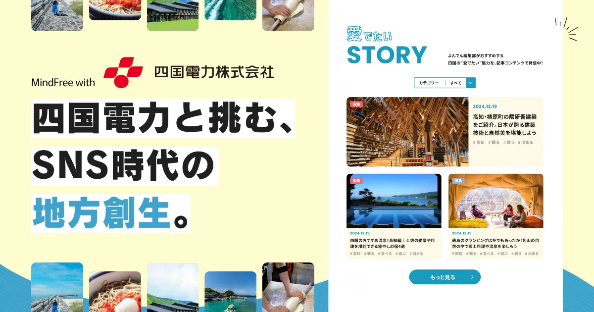
課題定義は「企業とユーザー間の距離をどのように測るか」から始めます。企業のブランド価値を最大化するために、Facebook、Twitter、Instagramをはじめとしたソーシャルメディア戦略のコミュニケーション設計を通じて、今までのアプローチ手法では実現しづらかったユーザー体験を実現します。マインドフリーは一気通貫してご提案、実施、検証、改善を行います。</p>
    </div>
</section>
<section class="c-singlebox" data-imgposition="left">
    <div class="c-singlebox__image">
        <picture>
            <source media="(max-width: 767px)" srcset="/assets/image/top/img_media.png">
            <img src="/assets/image/top/img_media.png" alt="">
        </picture>
    </div>
    <div class="c-singlebox__body">
        <h3 class="c-singlebox__title">Headline 4</h3>
        <ul class="c-singlebox__list">
            <li class="c-singlebox__list__item">ソーシャルメディアマーケティング</li>
            <li class="c-singlebox__list__item">オムニチャネル／CRM</li>
            <li class="c-singlebox__list__item">ウェブサイトマネジメント</li>
            <li class="c-singlebox__list__item">ウェブ／アプリ開発</li>
            <li class="c-singlebox__list__item">iDesign</li>
        </ul>
        <div class="c-singlebox__btn">
            <a class="c-button icon-right" role="button" href="#"><i class="material-icons">add</i>詳しく見る</a>
        </div>
    </div>
</section>
```
*/
.c-singlebox {
  display: flex;
  flex-wrap: wrap;
  margin-bottom: 8rem;
  margin-top: 5rem;
  margin-left: auto;
  margin-right: auto;
  background-color: #fff;
  max-width: 1280px; }
  @media (min-width: 768px) {
    .c-singlebox {
      min-height: 320px; } }
  @media (max-width: 767px) {
    .c-singlebox {
      margin-bottom: 5rem; } }
  .c-singlebox__image {
    flex-grow: 1;
    flex-shrink: 1;
    flex-basis: 50%;
    position: relative; }
    @media (min-width: 992px) {
      .c-singlebox__image {
        max-height: 450px; } }
    @media (min-width: 768px) {
      .c-singlebox__image {
        max-width: 50%; } }
    @media (max-width: 767px) {
      .c-singlebox__image {
        flex: 100%; } }
    .c-singlebox__image img {
      width: 100%;
      height: 100%;
      object-fit: cover; }
@keyframes img-anime {
  0% {
    left: -100%; }
  50% {
    left: 0; }
  100% {
    left: 100%; } }
  .c-singlebox__body {
    flex-grow: 1;
    flex-shrink: 1;
    flex-basis: 50%;
    position: relative;
    text-align: center;
    margin: auto;
    padding: 2rem 1.5rem; }
    @media (min-width: 768px) {
      .c-singlebox__body {
        max-width: 50%; } }
    @media (max-width: 767px) {
      .c-singlebox__body {
        flex: 100%; } }
  .c-singlebox__title {
    font-size: 1.5rem;
    margin-bottom: 2rem; }
    @media (max-width: 767px) {
      .c-singlebox__title {
        font-size: 1.125rem; } }
  .c-singlebox__text {
    margin: 0;
    text-align: justify;
    margin-bottom: 1.5rem; }
    @media (min-width: 768px) {
      .c-singlebox__text {
        padding-left: 2rem;
        padding-right: 2rem; } }
    @media (max-width: 767px) {
      .c-singlebox__text {
        font-size: 1rem; } }
  .c-singlebox__list {
    display: inline-block;
    text-align: left;
    margin-bottom: 1.5rem;
    list-style: none;
    padding-left: 1rem; }
    @media (max-width: 767px) {
      .c-singlebox__list {
        font-size: 1rem; } }
    .c-singlebox__list__item {
      position: relative;
      padding-left: .5rem;
      margin-bottom: .5rem; }
      .c-singlebox__list__item::before {
        content: "";
        position: absolute;
        display: block;
        background-color: #95989A;
        width: 9px;
        height: 9px;
        border-radius: 50%;
        left: -1em;
        top: .5em; }
  .c-singlebox[data-imgposition="left"] .c-singlebox__image {
    order: 0; }
  .c-singlebox[data-imgposition="left"] .c-singlebox__body::after {
    right: 100%;
    top: 50%;
    border: solid transparent;
    content: " ";
    height: 0;
    width: 0;
    position: absolute;
    border-right-color: #fff;
    border-width: 30px;
    margin-top: -30px;
    z-index: 1; }
    @media (max-width: 767px) {
      .c-singlebox[data-imgposition="left"] .c-singlebox__body::after {
        right: 50%;
        top: 1px;
        border: 30px solid transparent;
        margin-right: -30px;
        border-bottom-color: #fff;
        border-top-width: 0;
        width: 0; } }
  .c-singlebox[data-imgposition="right"] .c-singlebox__image {
    order: 1; }
    @media (max-width: 767px) {
      .c-singlebox[data-imgposition="right"] .c-singlebox__image {
        order: 0; } }
  .c-singlebox[data-imgposition="right"] .c-singlebox__body::after {
    left: 100%;
    top: 50%;
    border: solid transparent;
    content: " ";
    height: 0;
    width: 0;
    position: absolute;
    border-left-color: #fff;
    border-width: 30px;
    margin-top: -30px;
    z-index: 1; }
    @media (max-width: 767px) {
      .c-singlebox[data-imgposition="right"] .c-singlebox__body::after {
        left: 50%;
        top: 1px;
        border: 30px solid transparent;
        margin-left: -30px;
        border-bottom-color: #fff;
        border-top-width: 0;
        width: 0; } }

/*
---
name: Nextpage link
category: object/Component/nextpage
---

```html
<div class="l-container--fluid">
	<nav>
		<a class="c-nextpage" data-grad="aboutus" href="#">
			<p class="c-nextpage__title" data-color="aboutus">About Us</p>
			<img class="c-nextpage__img" src="/assets/image/common/ic_navigate_nextpage_toright.svg" alt="">
		</a>
	</nav>
</div>
<div class="l-container--fluid">
	<nav>
		<a class="c-nextpage" data-grad="service" href="#">
			<p class="c-nextpage__title" data-color="service">Service</p>
			<img class="c-nextpage__img" src="/assets/image/common/ic_navigate_nextpage_toright.svg" alt="">
		</a>
	</nav>
</div>
<div class="l-container--fluid">
	<nav>
		<a class="c-nextpage" data-grad="media" href="#">
			<p class="c-nextpage__title" data-color="media">Media</p>
			<img class="c-nextpage__img" src="/assets/image/common/ic_navigate_nextpage_toright.svg" alt="">
		</a>
	</nav>
</div>
<div class="l-container--fluid">
	<nav>
        <a class="c-nextpage" data-grad="recruit" href="#">
            <p class="c-nextpage__title" data-color="recruit">Recruit</p>
            <img class="c-nextpage__img" src="/assets/image/common/ic_navigate_nextpage_toright.svg" alt="">
        </a>
    </nav>
</div>
<div class="l-container--fluid">
    <nav>
        <a class="c-nextpage" data-grad="contact" href="#">
            <p class="c-nextpage__title" data-color="contact">Contact</p>
            <img class="c-nextpage__img" src="/assets/image/common/ic_navigate_nextpage_toright.svg" alt="">
        </a>
    </nav>
</div>
```
*/
.c-nextpage {
  display: block;
  position: relative;
  text-decoration: none;
  font-weight: bold;
  font-size: 80px;
  background-color: #fff;
  width: 100%;
  text-align: center;
  overflow: hidden;
  z-index: 15;
  padding-top: 100px;
  padding-bottom: 100px;
  -webkit-transition: 1s;
  -moz-transition: 1s;
  -o-transition: 1s;
  -ms-transition: 1s;
  transition: 1s; }
  @media (max-width: 767px) {
    .c-nextpage {
      font-size: 2.25rem;
      padding-top: 3rem;
      padding-bottom: 3rem; } }
  .c-nextpage::before {
    content: "";
    position: absolute;
    top: 0px;
    left: -100%;
    height: 100%;
    width: 100%;
    -webkit-transition: 0.5s;
    -moz-transition: 0.5s;
    -o-transition: 0.5s;
    -ms-transition: 0.5s;
    transition: 0.5s;
    z-index: -1; }
    @media (max-width: 767px) {
      .c-nextpage::before {
        -webkit-transition: 0.1s;
        -moz-transition: 0.1s;
        -o-transition: 0.1s;
        -ms-transition: 0.1s;
        transition: 0.1s; } }
  .c-nextpage[data-grad="aboutus"] {
    border-top: 1px solid #FF9B14;
    border-bottom: 1px solid #FF9B14; }
    .c-nextpage[data-grad="aboutus"]::before {
      background: linear-gradient(85deg, #FFA700, #FFF858); }
    .c-nextpage[data-grad="aboutus"] .c-nextpage__img {
      stroke: #FF9B14; }
  .c-nextpage[data-grad="service"] {
    border-top: 1px solid #0DB73B;
    border-bottom: 1px solid #0DB73B; }
    .c-nextpage[data-grad="service"]::before {
      background: linear-gradient(85deg, #A6E353, #009B46); }
    .c-nextpage[data-grad="service"] .c-nextpage__img {
      stroke: #0DB73B; }
  .c-nextpage[data-grad="media"] {
    border-top: 1px solid #417BE4;
    border-bottom: 1px solid #417BE4; }
    .c-nextpage[data-grad="media"]::before {
      background: linear-gradient(85deg, #417BE4, #5CBAFF); }
    .c-nextpage[data-grad="media"] .c-nextpage__img {
      stroke: #417BE4; }
  .c-nextpage[data-grad="recruit"] {
    border-top: 1px solid #5340C3;
    border-bottom: 1px solid #5340C3; }
    .c-nextpage[data-grad="recruit"]::before {
      background: linear-gradient(85deg, #5D4ED5, #C156F0); }
    .c-nextpage[data-grad="recruit"] .c-nextpage__img {
      stroke: #5340C3; }
  .c-nextpage[data-grad="contact"] {
    border-top: 1px solid #FE4D76;
    border-bottom: 1px solid #FE4D76; }
    .c-nextpage[data-grad="contact"]::before {
      background: linear-gradient(85deg, #FC5EA6, #FF3C46); }
    .c-nextpage[data-grad="contact"] .c-nextpage__img {
      stroke: #FE4D76; }
  .c-nextpage:hover {
    text-decoration: none;
    border-top: 1px solid rgba(255, 255, 255, 0);
    border-bottom: 1px solid rgba(255, 255, 255, 0); }
    .c-nextpage:hover:before {
      left: 0; }
    .c-nextpage:hover .c-nextpage__title {
      color: #fff; }
    .c-nextpage:hover .c-nextpage__img {
      stroke: #fff; }
  .c-nextpage.hover {
    text-decoration: none;
    border-top: 1px solid rgba(255, 255, 255, 0);
    border-bottom: 1px solid rgba(255, 255, 255, 0); }
    .c-nextpage.hover:before {
      left: 0; }
    .c-nextpage.hover .c-nextpage__title {
      color: #fff; }
    .c-nextpage.hover .c-nextpage__img {
      stroke: #fff; }
  .c-nextpage__title {
    margin: 0;
    color: #111;
    -webkit-transition: .4s;
    -moz-transition: .4s;
    -o-transition: .4s;
    -ms-transition: .4s;
    transition: .4s; }
    .c-nextpage__title[data-color="aboutus"] {
      color: #FF9B14; }
    .c-nextpage__title[data-color="service"] {
      color: #0DB73B; }
    .c-nextpage__title[data-color="media"] {
      color: #417BE4; }
    .c-nextpage__title[data-color="recruit"] {
      color: #5340C3; }
    .c-nextpage__title[data-color="contact"] {
      color: #FE4D76; }
  .c-nextpage__img {
    position: absolute;
    width: 80px;
    top: 50%;
    right: 15%;
    fill: none;
    -webkit-transition: 0.5s;
    -moz-transition: 0.5s;
    -o-transition: 0.5s;
    -ms-transition: 0.5s;
    transition: 0.5s; }
    @media (max-width: 767px) {
      .c-nextpage__img {
        width: 36px;
        right: 10%; } }

/*
---
name: Button
category: object/Component/button
---

```html
<a class="c-button icon-right" role="button" href="#"><i class="material-icons">add</i>詳しく見る</a>

<a class="c-button icon-right" role="button" href="#"><i class="material-icons">open_in_new</i>詳しく見る</a>

<a class="c-button icon-right" data-size="large" role="button" href="#"><i class="material-icons">send</i>メールで問い合わせる</a>
```
*/
/*
---
name: Button /bg-black
category: object/Component/button
---

```html
<div style="background-color: #212121;">
	<a class="c-button icon-right" role="button" data-bg="black" href="#"><i class="material-icons">add</i>詳しく見る</a>
	<a class="c-button icon-right" data-size="large" data-bg="black" role="button" href="#"><i class="material-icons">send</i>メールで問い合わせる</a>
</div>
```
*/
.c-button {
  display: inline-flex;
  align-items: center;
  position: relative;
  background-color: #212121;
  border: 1px solid #212121;
  padding: .5rem 2rem;
  border-radius: 40px;
  font-size: 1rem;
  color: #fff;
  z-index: 1;
  overflow: hidden;
  font-weight: bold; }
  .c-button[data-size="large"] {
    font-size: 1.5rem; }
    @media (max-width: 767px) {
      .c-button[data-size="large"] {
        font-size: 1.21875rem; } }
  .c-button[data-bg="black"] {
    background-color: transparent;
    border: 2px solid #fff; }
    .c-button[data-bg="black"]::before {
      border: 2px solid #212121; }
  .c-button[data-bg="home"] {
    background-color: #FF4446;
    border: 1px solid #FF4446; }
    .c-button[data-bg="home"]::before {
      border: 1px solid #fff; }
    .c-button[data-bg="home"]:hover {
      color: #FF4446 !important; }
    @media (max-width: 767px) {
      .c-button[data-bg="home"] {
        font-size: 0.875rem;
        padding: .5rem 1rem; }
        .c-button[data-bg="home"] i {
          font-size: 1rem; } }
  .c-button:hover {
    color: #212121;
    text-decoration: none; }
    .c-button:hover::before {
      left: 0; }
  .c-button.icon-right i {
    order: 1;
    margin-left: .5rem; }
  .c-button::before {
    content: "";
    border-radius: 40px;
    position: absolute;
    top: 0px;
    left: -100%;
    height: 100%;
    width: 100%;
    background: #fff;
    border: 1px solid #fff;
    -webkit-transition: .4s;
    -moz-transition: .4s;
    -o-transition: .4s;
    -ms-transition: .4s;
    transition: .4s;
    z-index: -1; }

/*
---
name: Newslist
category: object/Component/newslist
---

```html
<section class="c-newslist">
	<a href="#" class="c-newslist__list">
		<dl class="c-newslist__dl">
			<dt class="c-newslist__meta">2017.1.31 <span class="c-newslist__category">お知らせ</span></dt>
			<dd class="c-newslist__title">マインドフリーのホームページをリニューアルしました。ダミーテキストダミーテキストダミーテキスト</dd>
		</dl>
    </a>
    <a href="#" class="c-newslist__list">
        <dl class="c-newslist__dl">
            <dt class="c-newslist__meta">2017.1.31 <span class="c-newslist__category">新サービス</span></dt>
            <dd class="c-newslist__title">マインドフリーのホームページをリニューアルしました。ダミーテキストダミーテキストダミーテキストダミーテキストダミーテキストダミーテキストダミーテキストダミーテキストダミーテキスト</dd>
        </dl>
    </a>
</section>
```
*/
.c-newslist__list {
  display: block;
  position: relative;
  background-color: #fff;
  border-top: 1px solid #EFEFEF;
  color: #000;
  -webkit-transition: 0.3s;
  -moz-transition: 0.3s;
  -o-transition: 0.3s;
  -ms-transition: 0.3s;
  transition: 0.3s; }
  .c-newslist__list:last-of-type {
    border-bottom: 1px solid #EFEFEF; }
  .c-newslist__list:hover {
    text-decoration: none;
    color: #000;
    box-shadow: 0 10px 30px rgba(0, 0, 0, 0.1);
    z-index: 1; }
.c-newslist__dl {
  display: flex;
  flex-wrap: wrap;
  align-items: center;
  margin: 0;
  padding-top: 1rem;
  padding-bottom: 1rem; }
.c-newslist__meta {
  margin: 0;
  flex: 25%;
  padding-left: .5rem;
  font-size: 0.875rem;
  color: #95989A;
  word-break: keep-all; }
  @media (min-width: 768px) {
    .c-newslist__meta {
      max-width: 25%; } }
  @media (max-width: 767px) {
    .c-newslist__meta {
      flex: 100%;
      margin-bottom: .75rem; } }
.c-newslist__category {
  width: 110px;
  display: inline-block;
  text-align: center;
  border: 1px solid #F3282E;
  color: #F3282E;
  margin-left: .5rem;
  padding: .25rem .5rem; }
.c-newslist__title {
  margin: 0;
  position: relative;
  flex: 75%;
  padding-right: 2.75rem;
  color: #000; }
  @media (min-width: 768px) {
    .c-newslist__title {
      max-width: 75%; } }
  .c-newslist__title::after {
    content: "";
    position: absolute;
    top: 50%;
    right: 0;
    width: 2rem;
    height: 10px;
    margin-right: .5rem;
    background: url(../image/common/ic_navigate_next_toright.svg) center top no-repeat;
    background-size: contain; }
  @media (max-width: 767px) {
    .c-newslist__title {
      flex: 100%;
      padding-left: .5rem; } }

/*
---
name: Profile
category: object/Component/profile
---

```html
<section class="c-profile">
    <div class="c-profile__wrapper">
        <div class="c-profile__image" data-layout="col-1">
            <picture>
                <source media="(max-width: 767px)" srcset="/assets/image/aboutus/prof_nishiguchi@2x.png">
                <img src="/assets/image/aboutus/prof_nishiguchi.png" alt="">
            </picture>
        </div>
        <div class="c-profile__body"  data-layout="col-1">
            <p class="c-profile__join">2011年入社</p>
            <p class="c-profile__role">ソリューションプランナー／マネージャー</p>
            <p class="c-profile__name">西口陽介</p>
            <p class="c-profile__text">
                アーティストを目指し大学では音楽を専攻。バンド活動中にWEBサイト構築を手がけ、その後ショップにて独学でプログラミングやコーディング技術を習得。半年間のフリーランスを経て、より多くの経験を積むためにマインドフリーへ。「利益や効率より、面白いもの、新しいものを創り出す姿勢」に惹かれ、入社を決意。
            </p>
            <div class="c-profile__sns">
                <div class="c-profile__snsitem">
                    <a href="http://fb.com/daniel.leungmanyin" target="_blank"><img src="/assets/image/aboutus/ico-facebook.svg" alt=""><p>daniel.leungmanyin</p></a>
                    <a href="http://twitter.com/mindfree_daniel" target="_blank"><img src="/assets/image/aboutus/ico-twitter.svg" alt=""><p>mindfree_daniel</p></a>
                    <a href="https://www.instagram.com/daniel_leung0704/" target="_blank"><img src="/assets/image/aboutus/ico-instagram.svg" alt=""><p>daniel_leung0704</p></a>
                </div>
            </div>
        </div>
    </div>
</section>

<section class="c-profile">
    <div class="c-profile__wrapper" data-layout="col-2">
        <div class="c-profile__image" data-layout="col-2">
            <picture>
                <source media="(max-width: 767px)" srcset="/assets/image/aboutus/prof_nishiguchi@2x.png">
                <img src="/assets/image/aboutus/prof_nishiguchi.png" alt="">
            </picture>
        </div>
        <div class="c-profile__body" data-layout="col-2">
            <p class="c-profile__join">2011年入社</p>
            <p class="c-profile__role">ソリューションプランナー／マネージャー</p>
            <p class="c-profile__name">西口陽介</p>
            <p class="c-profile__text">
                アーティストを目指し大学では音楽を専攻。バンド活動中にWEBサイト構築を手がけ、その後ショップにて独学でプログラミングやコーディング技術を習得。半年間のフリーランスを経て、より多くの経験を積むためにマインドフリーへ。「利益や効率より、面白いもの、新しいものを創り出す姿勢」に惹かれ、入社を決意。
            </p>
        </div>
    </div>
    <div class="c-profile__wrapper" data-layout="col-2">
            <div class="c-profile__image" data-layout="col-2">
                <picture>
                    <source media="(max-width: 767px)" srcset="/assets/image/aboutus/prof_nishiguchi@2x.png">
                    <img src="/assets/image/aboutus/prof_nishiguchi.png" alt="">
                </picture>
            </div>
            <div class="c-profile__body" data-layout="col-2">
                <p class="c-profile__join">2011年入社</p>
                <p class="c-profile__role">ソリューションプランナー／マネージャー</p>
                <p class="c-profile__name">西口陽介</p>
                <p class="c-profile__text">
                    アーティストを目指し大学では音楽を専攻。バンド活動中にWEBサイト構築を手がけ、その後ショップにて独学でプログラミングやコーディング技術を習得。半年間のフリーランスを経て、より多くの経験を積むためにマインドフリーへ。「利益や効率より、面白いもの、新しいものを創り出す姿勢」に惹かれ、入社を決意。
                </p>
            </div>
        </div>
</section>
```
*/
.c-profile {
  display: flex;
  flex-wrap: wrap;
  max-width: 1000px;
  margin: 0 auto;
  margin-bottom: 3rem;
  align-items: baseline; }
  .c-profile__wrapper {
    display: flex;
    flex-wrap: wrap;
    align-items: center;
    margin: 1rem; }
    @media (max-width: 767px) {
      .c-profile__wrapper {
        margin-left: 0;
        margin-right: 0; } }
    @media (min-width: 768px) {
      .c-profile__wrapper[data-layout="col-2"] {
        flex: 1; } }
  .c-profile__image {
    text-align: center; }
    @media (max-width: 767px) {
      .c-profile__image {
        width: 200px;
        margin: 0 auto; } }
    @media (min-width: 768px) {
      .c-profile__image[data-layout="col-1"] {
        flex: 1; } }
    .c-profile__image[data-layout="col-2"] {
      margin: 0 auto 1rem auto; }
  @media (min-width: 768px) {
    .c-profile__body[data-layout="col-1"] {
      flex-grow: 2;
      flex-shrink: 1; } }
  .c-profile__join {
    margin: 0;
    padding-left: 1rem;
    border-left: 4px solid #FFBA00;
    font-size: 1rem; }
  .c-profile__role {
    margin: 0;
    padding-left: 1rem;
    border-left: 4px solid #FFBA00;
    font-size: .c-profile__role px16; }
  .c-profile__name {
    margin: 0;
    padding-left: 1rem;
    border-left: 4px solid #FFBA00;
    font-size: 1.5rem;
    margin-bottom: 1rem; }
  .c-profile__text {
    margin: 0;
    font-size: 0.875rem;
    text-align: justify; }
  .c-profile__sns {
    margin-top: 1rem; }
    .c-profile__snsitem {
      display: flex;
      flex-wrap: wrap; }
    .c-profile__sns a {
      display: flex;
      align-items: center;
      margin-right: 1.5rem;
      color: #333;
      transition: .3s;
      text-decoration: none; }
      @media (max-width: 767px) {
        .c-profile__sns a {
          width: 100%;
          margin-bottom: .5rem; } }
      .c-profile__sns a:hover {
        opacity: .7; }
      .c-profile__sns a p {
        margin-bottom: 0; }
      .c-profile__sns a img {
        width: 20px;
        margin-right: .5rem; }

/*
---
name: Datalist
category: object/Component/datalist
---

```html
<dl class="c-datalist">
    <dt class="c-datalist__title">データリストタイトル</dt>
    <dd class="c-datalist__body">データリスト本文</dd>
</dl>
<dl class="c-datalist">
    <dt class="c-datalist__title">データリストタイトル</dt>
    <dd class="c-datalist__body">データリスト本文</dd>
</dl>
```
*/
.c-datalist {
  display: flex;
  flex-wrap: wrap;
  margin: 0;
  font-size: 0.875rem; }
  .c-datalist:last-of-type .c-datalist__title {
    border-bottom: 1px solid #FFBA00; }
    @media (max-width: 767px) {
      .c-datalist:last-of-type .c-datalist__title {
        border-bottom: none; } }
  .c-datalist:last-of-type .c-datalist__body {
    border-bottom: 1px solid #D0D0D0; }
  .c-datalist__title {
    flex: 3;
    border-top: 1px solid #FFBA00;
    margin-right: 1rem;
    padding: 1rem; }
    @media (max-width: 767px) {
      .c-datalist__title {
        flex: 100%;
        margin-right: 0;
        padding-bottom: 0;
        border-top: 1px solid #D0D0D0; } }
  .c-datalist__body {
    flex: 7;
    margin: 0;
    padding: 1rem;
    border-top: 1px solid #D0D0D0; }
    .c-datalist__body.is-column {
      display: flex;
      flex-direction: column;
      align-items: flex-start; }
    .c-datalist__body.is-flex {
      display: flex;
      align-items: center;
      flex-wrap: wrap; }
      @media (max-width: 767px) {
        .c-datalist__body.is-flex.is-sa {
          justify-content: center; } }
      .c-datalist__body.is-flex.is-sa img {
        width: calc(179px/2);
        margin-bottom: 1rem; }
      .c-datalist__body.is-flex.is-sa p {
        width: calc(100% - 105px);
        text-align: left; }
    .c-datalist__body.is-2col {
      display: flex;
      flex-wrap: wrap;
      justify-content: space-between; }
    .c-datalist__body > *:last-child, .c-datalist__body > *:last-child > *:last-child, .c-datalist__body > *:last-child > *:last-child > *:last-child {
      margin-bottom: 0; }
    .c-datalist__body__inner {
      width: calc(50% - 8px);
      padding: .75rem; }
      @media (max-width: 767px) {
        .c-datalist__body__inner {
          width: 100%; } }
      .c-datalist__body__inner:first-child {
        background-color: #f6f4ff; }
        @media (max-width: 767px) {
          .c-datalist__body__inner:first-child {
            margin-bottom: 1rem; } }
      .c-datalist__body__inner:nth-child(2) {
        background-color: #fff4f6; }
      .c-datalist__body__inner > *:last-child, .c-datalist__body__inner > *:last-child > *:last-child, .c-datalist__body__inner > *:last-child > *:last-child > *:last-child {
        margin-bottom: 0; }
    .c-datalist__body__ttl {
      font-weight: bold; }
    @media (max-width: 767px) {
      .c-datalist__body br.pcbr {
        display: none; } }
    @media (max-width: 767px) {
      .c-datalist__body img {
        margin-bottom: .5rem; } }
    @media (max-width: 767px) {
      .c-datalist__body {
        flex: 100%;
        border-top: none; } }
    .c-datalist__body p.no-mb {
      margin-bottom: 0; }
    .c-datalist__body ol {
      margin-bottom: 0;
      padding-left: 1rem; }
      .c-datalist__body ol li {
        line-height: 2; }
    .c-datalist__body ul {
      display: inline-block;
      text-align: left;
      list-style: none;
      padding-left: 1em; }
      @media (max-width: 767px) {
        .c-datalist__body ul {
          font-size: 0.875rem; } }
      .c-datalist__body ul li {
        position: relative;
        margin-bottom: 0; }
        .c-datalist__body ul li::before {
          content: "";
          position: absolute;
          display: block;
          background-color: #95989A;
          width: 9px;
          height: 9px;
          border-radius: 50%;
          left: -1em;
          top: .5em; }
    .c-datalist__body a.is-txtlink {
      color: #212529; }
      .c-datalist__body a.is-txtlink + .is-txtlink {
        margin-top: .875rem; }
  .c-datalist__textlink {
    color: #5340C3; }
    .c-datalist__textlink i {
      font-size: inherit;
      line-height: 1; }

/*
---
name: Pagenation
category: object/Component/pagenation
---

```html
<section class="c-pagenation">
    <a href="#" class="c-pagenation__ico">
        <img src="/assets/image/common/ic_navigate_prev_toleft.svg" alt="">
    </a>

    <span class="c-pagenation__number is-current">1</span>
    <a href="#" class="c-pagenation__number">2</a>
    <a href="#" class="c-pagenation__number">3</a>

    <a href="#" class="c-pagenation__ico">
        <img src="/assets/image/common/ic_navigate_next_toright.svg" alt="">
    </a>
</section>
```
*/
/*
---
name: Pagenation ブログカラー
category: object/Component/pagenation
---

```html
<section class="c-pagenation is-blog">
    <a href="#" class="c-pagenation__ico">
        <img src="/assets/image/common/ic_navigate_prev_toleft.svg" alt="">
    </a>

    <span class="c-pagenation__number is-current">1</span>
    <a href="#" class="c-pagenation__number">2</a>
    <a href="#" class="c-pagenation__number">3</a>

    <a href="#" class="c-pagenation__ico">
        <img src="/assets/image/common/ic_navigate_next_toright.svg" alt="">
    </a>
</section>
```
*/
.c-pagenation {
  max-width: 300px;
  margin-left: auto;
  margin-right: auto;
  margin-top: 3rem;
  margin-bottom: 3rem;
  display: flex;
  justify-content: center;
  text-align: center;
  align-items: center; }
  .c-pagenation__ico {
    display: inline-block;
    width: 2.5rem;
    margin: 0 .7rem; }
    .c-pagenation__ico img {
      width: 100%; }
  .c-pagenation__number {
    border: 1px solid #F3282E;
    padding: .5rem .75rem;
    margin: 0 .7rem;
    color: #F3282E; }
    .c-pagenation__number.is-current {
      background: linear-gradient(85deg, #FF000A, #FF9E57);
      color: #fff; }
  .c-pagenation.is-blog .c-pagenation__number {
    border: 1px solid #417BE4;
    color: #417BE4; }
    .c-pagenation.is-blog .c-pagenation__number.is-current {
      background: linear-gradient(85deg, #417BE4, #5CBAFF);
      color: #fff; }

.c-clients {
  max-width: 1000px;
  margin-right: auto;
  margin-left: auto;
  margin-bottom: 3rem; }
  .c-clients__item {
    text-align: center; }
    @media (max-width: 767px) {
      .c-clients__item {
        padding-left: 1rem;
        padding-right: 1rem; } }

/*
---
name: Chat
category: object/Component/chat
---

```html
	<section class="c-chat">
        <div class="c-chat__body" data-person="ueda" data-position="left">
            <p><span>「愛のある仕事」って、言わば相手への関心とも言える</span>かな。お客様だったり、パートナーさんだったり、仲間だったり･･･。</p>
        </div>
    </section>
    <section class="c-chat">
        <div class="c-chat__body" data-person="taniguchi" data-position="right">
            <p>初めて営業の先輩に同行してお客様を訪問したときのことかな。何かのタイミングで意見を振られたんだけど、緊張のあまり上手く話せなかったんですよ。</p>
        </div>
        <div class="c-chat__body" data-person="taniguchi" data-position="right">
            <p>その帰りに「お客様から見れば1年目も10年目も関係なく、君もプロの一人。その自覚を持たないといけない」って先輩の言葉が心に残っていますね。思えばあの時が、<span>マインドフリーの一員としての自覚が芽生えた瞬間</span>だったかも。</p>
        </div>
    </section>
    <section class="c-chat">
        <div class="c-chat__body" data-person="nishikawa" data-position="left">
            <p><span>お客様に深く入り込んでベストを追求する</span>ところが、マインドフリーの独自性でもあり強みだからね。そこには「これで良い」っていうゴールがない。</p>
        </div>
    </section>
    <section class="c-chat">
        <div class="c-chat__body" data-person="sakurai" data-position="right">
            <p>仕事量が増えたことと、一番変わったのは仕事への姿勢です。 最初は与えられた仕事に取り組むという“受け身”でしたが、<span>最近は自発的に動いて、どんどん新しいことにチャレンジしています。</span></p>
        </div>
    </section>
    <section class="c-chat">
        <div class="c-chat__body" data-person="kadani" data-position="right">
            <p>私は当初WEBデザインを希望していて、現在の仕事はやりたい事とは異なっているんですけど、実際にやってみると<span>思った以上に楽しいし期待以上のことを学べています</span>ね。</p>
        </div>
    </section>
    <section class="c-chat">
        <div class="c-chat__body" data-person="kamiya" data-position="right">
            <p>私は希望していた部署でしたので、イメージ通りというか、<span>やりたい仕事に取り組めています。</span>だけど、ここに来て新たな野望も生まれてきました（笑）。</p>
        </div>
    </section>
```
*/
.c-chat {
  margin-bottom: 3rem;
  opacity: 0; }
  .c-chat__body {
    position: relative;
    background-color: #f3f3f3;
    max-width: 500px;
    padding: 1rem;
    border-radius: 10px;
    margin-bottom: 1rem;
    text-align: justify; }
    .c-chat__body p {
      margin-bottom: 0; }
      @media (max-width: 767px) {
        .c-chat__body p {
          font-size: 0.875rem; } }
    .c-chat__body[data-position="left"] {
      margin-right: auto;
      margin-left: 5rem; }
      .c-chat__body[data-position="left"]:before {
        content: "";
        right: 100%;
        margin-right: 1rem;
        width: 60px;
        height: 60px; }
      .c-chat__body[data-position="left"]:after {
        content: "";
        right: 100%;
        top: 25%;
        border: solid transparent;
        height: 0;
        width: 0;
        position: absolute;
        border-right-color: #f3f3f3;
        border-width: 10px;
        margin-top: -10px; }
    .c-chat__body[data-position="right"] {
      margin-left: auto;
      margin-right: 5rem; }
      .c-chat__body[data-position="right"]:before {
        content: "";
        left: 100%;
        margin-left: 1rem;
        width: 60px;
        height: 60px; }
      .c-chat__body[data-position="right"]:after {
        content: "";
        left: 100%;
        top: 25%;
        border: solid transparent;
        height: 0;
        width: 0;
        position: absolute;
        border-left-color: #f3f3f3;
        border-width: 10px;
        margin-top: -10px; }
    .c-chat__body[data-person="ueda"]:before {
      background: url(../image/aboutus/ico-ueda.png) center bottom;
      position: absolute;
      top: 0; }
      @media (max-width: 767px) {
        .c-chat__body[data-person="ueda"]:before {
          background: url(../image/aboutus/ico-ueda@2x.png) center bottom;
          background-size: contain; } }
    .c-chat__body[data-person="ueda"] p span {
      color: #417BE4; }
    .c-chat__body[data-person="taniguchi"]:before {
      background: url(../image/aboutus/ico-taniguchi.png) center bottom;
      position: absolute;
      top: 0; }
      @media (max-width: 767px) {
        .c-chat__body[data-person="taniguchi"]:before {
          background: url(../image/aboutus/ico-taniguchi@2x.png) center bottom;
          background-size: contain; } }
    .c-chat__body[data-person="taniguchi"] p span {
      color: #FF4822; }
    .c-chat__body[data-person="nishikawa"]:before {
      background: url(../image/aboutus/ico-nishikawa.png) center bottom;
      position: absolute;
      top: 0; }
      @media (max-width: 767px) {
        .c-chat__body[data-person="nishikawa"]:before {
          background: url(../image/aboutus/ico-nishikawa@2x.png) center bottom;
          background-size: contain; } }
    .c-chat__body[data-person="nishikawa"] p span {
      color: #01A801; }
    .c-chat__body[data-person="sakurai"]:before {
      background: url(../image/aboutus/ico-sakurai.png) center bottom;
      position: absolute;
      top: 0; }
      @media (max-width: 767px) {
        .c-chat__body[data-person="sakurai"]:before {
          background: url(../image/aboutus/ico-sakurai@2x.png) center bottom;
          background-size: contain; } }
    .c-chat__body[data-person="sakurai"] p span {
      color: #8400E5; }
    .c-chat__body[data-person="kadani"]:before {
      background: url(../image/aboutus/ico-kadani.png) center bottom;
      position: absolute;
      top: 0; }
      @media (max-width: 767px) {
        .c-chat__body[data-person="kadani"]:before {
          background: url(../image/aboutus/ico-kadani@2x.png) center bottom;
          background-size: contain; } }
    .c-chat__body[data-person="kadani"] p span {
      color: #FF0093; }
    .c-chat__body[data-person="kamiya"]:before {
      background: url(../image/aboutus/ico-kamiya.png) center bottom;
      position: absolute;
      top: 0; }
      @media (max-width: 767px) {
        .c-chat__body[data-person="kamiya"]:before {
          background: url(../image/aboutus/ico-kamiya@2x.png) center bottom;
          background-size: contain; } }
    .c-chat__body[data-person="kamiya"] p {
      margin-bottom: 0; }
      .c-chat__body[data-person="kamiya"] p span {
        color: #FF6C00; }

/*
---
name: Articlelink
category: object/Component/articlelink
---

```html
	<section class="c-articlelink">
        <a href="" target="_blank" class="c-articlelink__link">
            <div class="c-articlelink__image">
                <img src="/assets/image/service/img_article01.png" alt="">
            </div>
            <div class="c-articlelink__body">
                <p class="c-articlelink__media"><img src="/assets/image/service/ico_wd.png" alt="">Web Designing ONLINE</p>
                <p class="c-articlelink__title">企業のSNS戦略を支える ソーシャルディレクター #1</p>
                <button class="c-articlelink__button" aria-label="詳しく見る"><i class="material-icons">launch</i></button>
            </div>
        </a>
    </section>
```
*/
.c-articlelink {
  display: flex;
  flex-wrap: wrap;
  justify-content: center; }
  .c-articlelink__link {
    display: inline-flex;
    max-width: 490px;
    border: 1px solid #EFEFEF;
    padding: 1rem;
    margin-left: .5rem;
    margin-right: .5rem;
    transition: 0.3s;
    color: #000;
    margin-bottom: 1rem; }
    .c-articlelink__link:hover {
      text-decoration: none;
      box-shadow: 0 10px 30px rgba(0, 0, 0, 0.1); }
  .c-articlelink__image {
    flex-grow: 4;
    flex-shrink: 1;
    margin-right: 1rem; }
  .c-articlelink__body {
    flex-grow: 6;
    flex-shrink: 1;
    position: relative; }
  .c-articlelink__media img {
    margin-right: 1rem; }
  .c-articlelink__button {
    border: none;
    background-color: transparent;
    position: absolute;
    left: 80%;
    bottom: 0;
    color: #A3A3A3; }

/*
---
name: Tasklist
category: object/Component/tasklist
---

```html
<section class="c-tasklist">
    <ul class="c-tasklist__list">
        <li class="c-tasklist__item">どのようにソーシャルメディアの戦略、目標設定を立てていいのかわからない</li>
        <li class="c-tasklist__item">ソーシャルメディアの効果的な運用が中々できていない</li>
        <li class="c-tasklist__item">日々の投稿コンテンツが思い浮かばない</li>
        <li class="c-tasklist__item">広告効果があがらない</li>
        <li class="c-tasklist__item">ユーザーを巻き込んだ施策に取り組むのが難しい</li>
        <li class="c-tasklist__item">ソーシャルメディアの炎上リスクが怖い</li>
    </ul>
</section>
```
*/
.c-tasklist {
  margin-bottom: 3rem;
  margin-left: 1rem;
  margin-right: 1rem;
  text-align: center; }
  .c-tasklist__list {
    display: inline-block;
    text-align: left;
    padding-left: 2.25em; }
  .c-tasklist__item {
    list-style: none;
    font-size: 1.5rem;
    margin-top: 1.5rem;
    text-indent: -1em;
    padding-left: 1em;
    margin-left: -1em; }
    @media (max-width: 767px) {
      .c-tasklist__item {
        font-size: 1rem; } }
    .c-tasklist__item::before {
      content: '';
      width: 12px;
      height: 12px;
      display: inline-block;
      border-radius: 100%;
      background: #95989A;
      position: relative;
      left: -15px;
      top: -3px; }

.c-access {
  display: flex;
  flex-wrap: wrap;
  background-color: #fff;
  margin-bottom: 3rem; }
  .c-access__map {
    flex: 2;
    order: 1; }
    .c-access__map #map {
      width: 100%;
      height: 100%; }
    .c-access__map #mapTokyo {
      width: 100%;
      height: 100%; }
    .c-access__map #mapTaiwan {
      width: 100%;
      height: 100%; }
    .c-access__map #mapSakai {
      width: 100%;
      height: 100%; }
    @media (max-width: 767px) {
      .c-access__map {
        flex: 100%;
        height: 200px;
        order: 0; } }
  .c-access:nth-of-type(2n) .c-access__map {
    order: 0; }
  .c-access:nth-of-type(2n) .c-access__body {
    order: 1; }
  .c-access__body {
    flex: 1;
    order: 0;
    padding: 1.5rem; }
    @media (max-width: 767px) {
      .c-access__body {
        flex: 100%;
        order: 1; } }
    .c-access__body p a {
      color: #000; }
    .c-access__body .c-datalist__body {
      display: block; }
      .c-access__body .c-datalist__body p {
        margin-bottom: 0; }
  .c-access__title {
    font-size: 1.5rem;
    text-align: center;
    margin-bottom: 1.5rem; }
  .c-access__btn {
    margin-top: 1.5rem;
    text-align: center; }

/*
---
name: SNSlink
category: object/Component/snslink
---

```html
<section class="c-snslink">
    <div class="c-snslink__wrapper">
        <section class="c-snslink__fb">
            <p class="c-snslink__title"><img src="/assets/image/media/ico_facebook_color.png" alt=""> Facebook</p>
            <div class="fb-page" data-href="https://www.facebook.com/MindFreeJapan/" data-tabs="timeline" data-width="490" data-height="430" data-small-header="true" data-adapt-container-width="true" data-hide-cover="true" data-show-facepile="false"><blockquote cite="https://www.facebook.com/MindFreeJapan/" class="fb-xfbml-parse-ignore"><a href="https://www.facebook.com/MindFreeJapan/">MindFree_Japan</a></blockquote></div>
            
            <div class="c-snslink__btn">
                <a class="c-button icon-right" role="button" href="#"><i class="material-icons">open_in_new</i>詳しく見る</a>
            </div>
        </section>
        

        <section class="c-snslink__insta">
            <p class="c-snslink__title"><img src="/assets/image/media/ico_instagram_color.png" alt=""> Instagram</p>
            <div id="instafeed"></div>

            <div class="c-snslink__btn">
                <a class="c-button icon-right" role="button" href="#"><i class="material-icons">open_in_new</i>詳しく見る</a>
            </div>
        </section>
        
        <div id="fb-root"></div>
        <script>(function(d, s, id) {
                var js, fjs = d.getElementsByTagName(s)[0];
                if (d.getElementById(id)) return;
                js = d.createElement(s); js.id = id;
                js.src = 'https://connect.facebook.net/ja_KS/sdk.js#xfbml=1&version=v2.11';
                fjs.parentNode.insertBefore(js, fjs);
                }(document, 'script', 'facebook-jssdk'));</script>

        <script type="text/javascript">
            var feed = new Instafeed({
                get: 'user', 
                userId: '3079254781',
                accessToken:'3079254781.dd1821b.6333db128dd7427c90a402cee40bbc1f',
                links: true ,
                limit: 9,// 取得件数 
                resolution:'standard_resolution', // thumbnail (default) - 150x150 | low_resolution - 306x306 | standard_resolution - 612x612
                template: '<div class="l-col-4"><span><a href="{{link}}"><img src="{{image}}" /></a></span></div>', // 画像URL：{{image}} リンク：{{link}} キャプションテキスト{{caption}} いいね数：{{likes}} コメント数：{{comments}}
            
                success: function(){
                //取得完了時のコールバック
                }
            });
            feed.run();
        </script>
    </div>
</section>
```
*/
.c-snslink {
  display: block;
  max-width: 1000px;
  margin: 0 auto; }
  .c-snslink__wrapper {
    display: flex;
    flex-wrap: wrap;
    width: 100%; }
  .c-snslink__title {
    text-align: center; }
  .c-snslink__fb {
    width: 50%; }
    @media (max-width: 767px) {
      .c-snslink__fb {
        width: 100%;
        max-width: 500px;
        margin-left: auto;
        margin-right: auto; } }
    .c-snslink__fb .fb_iframe_widget,
    .c-snslink__fb .fb_iframe_widget span,
    .c-snslink__fb .fb_iframe_widget iframe[style] {
      width: 100% !important; }
    .c-snslink__fb__inner {
      width: 100%;
      padding-top: 86%;
      position: relative; }
      .c-snslink__fb__inner iframe {
        position: absolute;
        left: 0;
        top: 0;
        width: 100%;
        height: 100%; }
  .c-snslink__insta {
    width: 50%; }
    @media (max-width: 767px) {
      .c-snslink__insta {
        width: 100%;
        max-width: 500px;
        margin-left: auto;
        margin-right: auto; } }
    .c-snslink__insta #instafeed {
      display: flex;
      flex-wrap: wrap; }
      .c-snslink__insta #instafeed div {
        height: auto;
        position: relative; }
        .c-snslink__insta #instafeed div:before {
          content: "";
          display: block;
          padding-top: 100%; }
        .c-snslink__insta #instafeed div img {
          /* 正方形にするのに必要な部分 */
          display: block;
          position: absolute;
          top: 0;
          left: 0;
          width: 100%;
          height: 100%;
          /* 中央寄せ */
          text-align: center;
          padding: 0;
          box-sizing: border-box;
          -moz-box-sizing: border-box;
          -webkit-box-sizing: border-box;
          -o-box-sizing: border-box;
          -ms-box-sizing: border-box;
          object-fit: cover; }
  .c-snslink__btn {
    text-align: center;
    margin-top: 2rem;
    margin-bottom: 5rem; }

/*
---
name: form textarea
category: object/Component/form
---

```html
<div class="c-form">
    <p class="c-form__title"><span>＊</span>お問い合わせの詳細</p>
    <div class="c-form__textarea">
        <textarea name="detail" rows="8"> 具体的なお問い合わせ内容をご記入ください。</textarea>
    </div>
</div>
```
*/
/*
---
name: form text
category: object/Component/form
---

```html
<div class="c-form">
    <div class="c-form__text">
        <p class="c-form__title"><span>＊</span>貴社名</p>
        <input name="company_name" type="text" placeholder="例：マインドフリー株式会社" />
    </div>
    <div class="c-form__text">
        <p class="c-form__title">部署名</p>
        <input name="company_name" type="text" placeholder="例：広報部" />
    </div>
    <div class="c-form__text">
        <p class="c-form__title"><span>＊</span>ご担当者名</p>
        <input name="company_name" type="text" placeholder="例：山田 太郎" />
    </div>
    <div class="c-form__text">
        <p class="c-form__title"><span>＊</span>ご担当者名（ふりがな）</p>
        <input name="company_name" type="text" placeholder="例：やまだ たろう" />
    </div>
</div>
```
*/
/*
---
name: form checkbox
category: object/Component/form
---

```html
<div class="c-form">
    <div class="c-form__checkbox">
        <label>
        <input type="checkbox" name="checkbox[]" class="c-form__checkbox__input">
        <span class="c-form__checkbox__text"><a href="/privacy_policy/" title="">プライバシーポリシー</a>に同意する</span>
        </label>
    </div>
</div>
```
*/
.c-form {
  background-color: #fff;
  display: flex;
  flex-wrap: wrap; }
  @media (max-width: 767px) {
    .c-form {
      padding-left: .5rem;
      padding-right: .5rem; } }
  .c-form__title {
    font-weight: bold; }
    .c-form__title span {
      color: #FE4D76; }
  .c-form__radio {
    flex: 100%;
    border-radius: 3px;
    border: 1px solid #E0E0E0;
    margin-bottom: 3rem; }
    .c-form__radio .mwform-radio-field {
      display: block;
      position: relative;
      width: 100%;
      padding: 1rem 1rem 1rem 3rem;
      border-bottom: 1px solid #E0E0E0;
      margin-bottom: 0; }
      .c-form__radio .mwform-radio-field:last-of-type {
        border-bottom: none; }
    .c-form__radio label {
      margin-bottom: 0; }
      .c-form__radio label input {
        display: none; }
        .c-form__radio label input + span:before {
          content: "";
          display: block;
          position: absolute;
          top: 15px;
          left: 16px;
          width: 25px;
          height: 25px;
          border: 1px solid #C6C6C6;
          border-radius: 50%; }
        .c-form__radio label input:checked + span:before {
          border: 2px solid #FE4D76; }
        .c-form__radio label input:checked + span:after {
          content: "";
          display: block;
          position: absolute;
          top: 20px;
          left: 21px;
          width: 15px;
          height: 15px;
          background: #FE4D76;
          border-radius: 50%; }
  .c-form__textarea {
    flex: 100%;
    margin-bottom: 3rem; }
    .c-form__textarea textarea {
      width: 100%;
      border-radius: 3px;
      border: 1px solid #E0E0E0;
      padding: 1rem; }
  .c-form__text {
    flex: 50%;
    margin-bottom: 2rem; }
    .c-form__text:last-of-type {
      max-width: 50%; }
    @media (max-width: 767px) {
      .c-form__text {
        flex: 100%; } }
    .c-form__text input {
      width: 90%;
      padding: 1rem;
      border-radius: 3px;
      border: 1px solid #E0E0E0; }
      @media (max-width: 767px) {
        .c-form__text input {
          width: 100%; } }
  .c-form__checkbox {
    width: 100%;
    text-align: center; }
    .c-form__checkbox__input {
      display: none; }
      .c-form__checkbox__input:checked + .c-form__checkbox__text:after {
        content: "";
        display: block;
        position: absolute;
        top: -1px;
        left: 7px;
        width: 12px;
        height: 20px;
        transform: rotate(40deg);
        border-bottom: 3px solid #FE4D76;
        border-right: 3px solid #FE4D76; }
    .c-form__checkbox__text {
      padding-left: 2rem;
      position: relative;
      margin-right: 20px; }
      .c-form__checkbox__text::before {
        content: "";
        display: block;
        position: absolute;
        top: 0;
        left: 0;
        width: 25px;
        height: 25px;
        border: 1px solid #E0E0E0;
        border-radius: 3px; }
      .c-form__checkbox__text a {
        color: #111;
        border-bottom: 1px solid #111; }
        .c-form__checkbox__text a:hover {
          text-decoration: none;
          opacity: .7; }

/*
---
name: Dataset
category: object/Component/dataset
---

```html
<section class="c-dataset">
    <dl class="c-dataset__item">
        <dt class="c-dataset__title">PC</dt>
        <dd class="c-dataset__body">
            <p>Windows（8・10）をご利用の場合</p>
            <ul>
                <li>Internet Explorer 11</li>
                <li>Microsoft Edge 最新版</li>
                <li>Google Chrome 最新版</li>
                <li>Mozilla Firefox 最新版</li>
            </ul>
        </dd>
        <dd class="c-dataset__body">
            <p>Mac（Mac OS X 10.8以上）をご利用の場合</p>
            <ul>
                <li>Safari 最新版</li>
                <li>Google Chrome 最新版</li>
                <li>Mozilla Firefox 最新版</li>
            </ul>
        </dd>
    </dl>

    <dl class="c-dataset__item">
        <dt class="c-dataset__title">スマートフォン</dt>
        <dd class="c-dataset__body">
            <p>iOS端末をご利用の場合</p>
            <ul>
                <li>iOS9以上</li>
                <li>Safari 最新版</li>
            </ul>
        </dd>
        <dd class="c-dataset__body">
            <p>Android端末をご利用の場合</p>
            <ul>
                <li>Android4.4以上</li>
                <li>標準ブラウザ</li>
            </ul>
        </dd>
    </dl>

    <dl class="c-dataset__item">
        <dt class="c-dataset__title" data-color="home">Top</dt>
        <a href="/">
            <dd class="c-dataset__body">
                トップページ<i class="material-icons">keyboard_arrow_right</i>
            </dd>
        </a>
        <a href="/news/">
            <dd class="c-dataset__body">
                最新情報<i class="material-icons">keyboard_arrow_right</i>
            </dd>
        </a>
        <a href="/news/">
            <dd class="c-dataset__body">
                └ お知らせ<i class="material-icons">keyboard_arrow_right</i>
            </dd>
        </a>
    </dl>

    <dl class="c-dataset__item">
        <dt class="c-dataset__title" data-color="aboutus">AboutUs</dt>
        <a href="/aboutus">
            <dd class="c-dataset__body">
                マインドフリーについて<i class="material-icons">keyboard_arrow_right</i>
            </dd>
        </a>
        <a href="/aboutus/message01/">
            <dd class="c-dataset__body">
                メッセージ ― レオン・メイ・ダニエル<i class="material-icons">keyboard_arrow_right</i>
            </dd>
        </a>
    </dl>
</section>
```
*/
.c-dataset {
  display: flex;
  flex-wrap: wrap; }
  .c-dataset__item {
    width: 50%;
    padding: 1rem; }
    @media (max-width: 767px) {
      .c-dataset__item {
        width: 100%; } }
  .c-dataset__title {
    font-size: 1.5rem;
    padding-bottom: 1rem;
    border-bottom: 1px solid;
    word-break: break-all;
    width: 100%;
    max-width: 100%; }
    .c-dataset__title[data-color="home"] {
      color: #FF4446;
      border-color: #FF4446; }
    .c-dataset__title[data-color="aboutus"] {
      color: #FF9B14;
      border-color: #FF9B14; }
    .c-dataset__title[data-color="service"] {
      color: #0DB73B;
      border-color: #0DB73B; }
    .c-dataset__title[data-color="media"] {
      color: #417BE4;
      border-color: #417BE4; }
    .c-dataset__title[data-color="recruit"] {
      color: #5340C3;
      border-color: #5340C3; }
    .c-dataset__title[data-color="contact"] {
      color: #FE4D76;
      border-color: #FE4D76; }
  .c-dataset__body {
    border-bottom: 1px solid #E0E0E0;
    padding: 1rem;
    margin-bottom: 0;
    font-size: 1rem;
    position: relative;
    width: 100%;
    max-width: 100%; }
    .c-dataset__body i {
      font-size: 1rem;
      position: absolute;
      left: 90%;
      top: 40%; }
  .c-dataset a {
    color: #000;
    display: block;
    transition: .2s;
    width: 100%;
    max-width: 100%; }
    .c-dataset a:hover {
      text-decoration: none;
      box-shadow: 0 10px 30px rgba(0, 0, 0, 0.1); }

/*
---
name: HistoryTable
category: object/Component/historytable
---

```html
<section class="c-historytable">
    <div class="c-historytable__year">2006</div>
    <div class="c-historytable__item">
        <ul>
            <li>マインドフリー株式会社設立。CRM関連事業を展開。（大阪市中央区南船場１丁目）</li>
        </ul>
    </div>
    <div class="c-historytable__year">2007</div>
    <div class="c-historytable__item">
        <ul>
            <li>コミュニティプラットフォーム「飲茶」のBETA版をリリース。展示会に初出店。</li>
            <li>事業拡大の為、オフィスを移転。（大阪市中央区南船場2丁目）</li>
        </ul>
    </div>
    <div class="c-historytable__year">2008</div>
    <div class="c-historytable__item">
        <p class="c-historytable__itemtitle">キーワード　<span>LOVE</span></p>
        <ul>
            <li>「飲茶」がマイクロソフト社の公式サービスプロバイダソフトウェアに。正式版をリリース。</li>
            <li>「飲茶」のVersionⅡをリリースし、導入社数が累計20社に達す。</li>
        </ul>
    </div>
</section>
```
*/
.c-historytable {
  display: flex;
  flex-wrap: wrap; }
  .c-historytable:last-child {
    margin-bottom: 3rem; }
  .c-historytable__year {
    width: 20%;
    font-size: 1.5rem;
    padding-right: 1.5rem;
    text-align: right; }
    @media (max-width: 767px) {
      .c-historytable__year {
        width: 100%;
        text-align: left;
        margin-bottom: 1rem; } }
  .c-historytable__item {
    width: 80%;
    border-left: 1px solid #e1e1e1;
    padding-left: 1rem;
    padding-bottom: 1rem; }
    @media (max-width: 767px) {
      .c-historytable__item {
        width: 100%;
        border: none;
        padding-left: 0; } }
    .c-historytable__item ul {
      display: inline-block;
      text-align: left;
      list-style: none; }
      @media (max-width: 767px) {
        .c-historytable__item ul {
          font-size: 0.875rem; } }
      .c-historytable__item ul li {
        position: relative;
        margin-bottom: .5rem; }
        .c-historytable__item ul li::before {
          content: "";
          position: absolute;
          display: block;
          background-color: #95989A;
          width: 9px;
          height: 9px;
          border-radius: 50%;
          left: -20px;
          top: .5em; }
  .c-historytable__itemtitle {
    font-size: 1.125rem;
    font-weight: bold;
    line-height: 1; }
    @media (max-width: 767px) {
      .c-historytable__itemtitle {
        font-size: 1rem;
        margin-left: 1.5rem; } }
    .c-historytable__itemtitle span {
      color: #FF9B14;
      font-size: 2rem; }
      @media (max-width: 767px) {
        .c-historytable__itemtitle span {
          font-size: 1.21875rem; } }

canvas {
  display: block;
  z-index: 10; }

#particles-js {
  position: absolute;
  width: 100%;
  height: 100%; }

.text-anime-js {
  display: inline-block;
  overflow: hidden;
  text-shadow: none;
  position: relative;
  color: rgba(33, 37, 41, 0); }
  .text-anime-js::before {
    content: "";
    position: absolute;
    top: 0px;
    left: -100%;
    height: 100%;
    width: 100%;
    -webkit-transition: 0.5s;
    -moz-transition: 0.5s;
    -o-transition: 0.5s;
    -ms-transition: 0.5s;
    transition: 0.5s;
    z-index: 0; }
  .text-anime-js[data-color="none"]::before {
    background: #000; }
  .text-anime-js[data-color="none"].is-show {
    animation: text-anime-base .5s .5s linear forwards; }
  .text-anime-js[data-color="tenshin"]::before {
    background: #cc2f1b; }
  .text-anime-js[data-color="tenshin"].is-show {
    animation: text-anime-base .5s .5s linear forwards; }
  .text-anime-js[data-color="note"]::before {
    background: #3EC8B3; }
  .text-anime-js[data-color="note"].is-show {
    animation: text-anime-base .5s .5s linear forwards; }
  .text-anime-js[data-color="socialOh"]::before {
    background: #e65226; }
  .text-anime-js[data-color="socialOh"].is-show {
    animation: text-anime-base .5s .5s linear forwards; }
  .text-anime-js[data-color="aboutus"]::before {
    background: linear-gradient(85deg, #FFA700, #FFF858); }
  .text-anime-js[data-color="aboutus"].is-show {
    animation: text-anime-base-aboutus .5s .5s linear forwards; }
  .text-anime-js[data-color="service"]::before {
    background: linear-gradient(85deg, #A6E353, #009B46); }
  .text-anime-js[data-color="service"].is-show {
    animation: text-anime-base-service .5s .5s linear forwards; }
  .text-anime-js[data-color="media"]::before {
    background: linear-gradient(85deg, #417BE4, #5CBAFF); }
  .text-anime-js[data-color="media"].is-show {
    animation: text-anime-base-media .5s .5s linear forwards; }
  .text-anime-js[data-color="recruit"]::before {
    background: linear-gradient(85deg, #5D4ED5, #C156F0); }
  .text-anime-js[data-color="recruit"].is-show {
    animation: text-anime-base-recruit .5s .5s linear forwards; }
  .text-anime-js[data-color="contact"]::before {
    background: linear-gradient(85deg, #FC5EA6, #FF3C46); }
  .text-anime-js[data-color="contact"].is-show {
    animation: text-anime-base-contact .5s .5s linear forwards; }
  .text-anime-js.is-show::before {
    animation: text-anime 1s 0s ease-in-out; }

@keyframes text-anime {
  0% {
    left: -100%; }
  50% {
    left: 0; }
  100% {
    left: 100%; } }
@keyframes text-anime-base {
  0% {
    color: rgba(33, 37, 41, 0);
    text-shadow: none; }
  50% {
    color: #212529;
    text-shadow: none; }
  100% {
    color: #212529; } }
@keyframes text-anime-base-service {
  0% {
    color: rgba(13, 183, 59, 0);
    text-shadow: none; }
  50% {
    color: #0db73b;
    text-shadow: none; }
  100% {
    color: #0db73b; } }
@keyframes text-anime-base-aboutus {
  0% {
    color: rgba(255, 155, 20, 0);
    text-shadow: none; }
  50% {
    color: #ff9b14;
    text-shadow: none; }
  100% {
    color: #ff9b14; } }
@keyframes text-anime-base-media {
  0% {
    color: rgba(65, 123, 228, 0);
    text-shadow: none; }
  50% {
    color: #417be4;
    text-shadow: none; }
  100% {
    color: #417be4; } }
@keyframes text-anime-base-recruit {
  0% {
    color: rgba(83, 64, 195, 0);
    text-shadow: none; }
  50% {
    color: #5340c3;
    text-shadow: none; }
  100% {
    color: #5340c3; } }
@keyframes text-anime-base-contact {
  0% {
    color: rgba(254, 77, 118, 0);
    text-shadow: none; }
  50% {
    color: #fe4d76;
    text-shadow: none; }
  100% {
    color: #fe4d76; } }
.slide-anime-js::before {
  content: "";
  position: absolute;
  width: 100%;
  height: 100%;
  background-color: #fff;
  z-index: 2;
  transform-origin: right;
  transform: scale(1, 1);
  transition: .8s ease-in-out; }
.slide-anime-js.is-anime::before {
  transform: scale(0, 1); }

.fade-anime-js::before {
  content: "";
  position: absolute;
  width: 100%;
  height: 100%;
  left: 0;
  background-color: #fff;
  z-index: 2;
  transform-origin: right;
  transform: scale(1, 1);
  transition: .8s ease-in-out;
  pointer-events: none; }
  @media (max-width: 767px) {
    .fade-anime-js::before {
      transition: .5s ease-in-out; } }
.fade-anime-js[data-color="gray"]::before {
  background-color: #EFEFEF; }
.fade-anime-js.is-anime::before {
  opacity: 0;
  z-index: 0; }

/*
---
name: CategoryMenu
category: object/Component/categorymenu
---

```html
<section class="c-categorymenu">
    <div class="c-categorymenu__title">
        <p>サービス一覧</p>
    </div>
    <div class="c-categorymenu__wrapper">
        <ul>
            <li><a href="/service/omni-crm/">コミュニケーションプラットフォーム開発事業／オムニチャネルCRM事業</a></li>
            <li><a href="/service/social-media-marketing/">ソーシャルメディアマーケティング事業</a></li>
            <li><a href="/service/social-media-marketing/">ウェブサイトマネジメント事業</a></li>
            <li><a href="/service/website-management/">ウェブサイトマネジメント事業</a></li>
            <li><a href="/service/digital-integration/">デジタルインテグレーション事業</a></li>
            <li><a href="/service/ux-design/">UXデザイン事業（iDesign）</a></li>
        </ul>
    </div>
</section>
```
*/
.c-categorymenu {
  position: fixed;
  z-index: 1000;
  width: 100%; }
  .c-categorymenu__title {
    background-color: #eaeaea;
    text-align: center;
    cursor: pointer; }
    .c-categorymenu__title p {
      padding-top: .5rem;
      padding-bottom: .5rem;
      margin-bottom: 0;
      font-size: 1rem; }
      .c-categorymenu__title p .material-icons {
        font-size: 1rem;
        vertical-align: middle;
        transition: .3s; }
    .c-categorymenu__title.is-show .material-icons {
      transform: rotate(180deg); }
  .c-categorymenu__wrapper {
    text-align: center;
    display: none;
    background-color: rgba(0, 0, 0, 0.5);
    -webkit-backdrop-filter: blur(10px);
    backdrop-filter: blur(10px); }
    @media (max-width: 767px) {
      .c-categorymenu__wrapper {
        padding-left: .5rem;
        padding-right: .5rem; } }
    .c-categorymenu__wrapper ul {
      text-align: left;
      display: inline-block;
      margin-bottom: 0;
      padding-left: 0;
      list-style: none; }
      .c-categorymenu__wrapper ul li {
        padding-top: .5rem;
        padding-bottom: .5rem; }
        .c-categorymenu__wrapper ul li a {
          color: #fff;
          font-size: 0.875rem;
          text-decoration: none;
          position: relative;
          display: inline-block; }
          .c-categorymenu__wrapper ul li a .material-icons {
            font-size: 0.875rem;
            vertical-align: middle; }
          .c-categorymenu__wrapper ul li a::after {
            position: absolute;
            bottom: -2px;
            left: 50%;
            content: '';
            width: 0;
            height: 1px;
            background: #fff;
            transition: .3s;
            -webkit-transform: translateX(-50%);
            transform: translateX(-50%); }
          .c-categorymenu__wrapper ul li a:hover::after {
            width: 100%; }

/*
---
name: mainbox
category: object/Component/mainbox
---

```html
<div class="l-container--fruid">
    <section class="c-mainbox" data-bg="service">
        <div class="c-mainbox__body">
            <header class="c-hlgroup">
                <div><h1 class="c-hlgroup__pagetitle text-anime-js is-show" data-color="service">Service</h1></div>
                <div><p class="c-hlgroup__pagetitle text-anime-js is-show" data-color="none">感性と理性のあらゆる可能性を</p></div>
            </header>
            <ul class="c-mainbox__list">
                <li class="c-mainbox__list__item">コミュニケーションプラットフォーム開発事業／オムニチャネルCRM事業</li>
                <li class="c-mainbox__list__item">ソーシャルメディアマーケティング事業</li>
                <li class="c-mainbox__list__item">ウェブサイトマネジメント事業</li>
                <li class="c-mainbox__list__item">デジタルインテグレーション事業</li>
                <li class="c-mainbox__list__item">UXデザイン事業（iDesign）</li>
            </ul>
            <div class="c-mainbox__button">
                <a class="c-button icon-right" role="button" href="#"><i class="material-icons">add</i>詳しく見る</a>
            </div>
        </div>
    </section>
</div>
```
*/
.c-mainbox {
  display: flex;
  background-size: cover;
  justify-content: center;
  align-items: center;
  margin-bottom: 5rem;
  padding-top: 10%;
  padding-bottom: 10%; }
  @media (max-width: 767px) {
    .c-mainbox {
      padding-top: 0;
      padding-bottom: 0; } }
  .c-mainbox[data-bg="service"] {
    background: url("../image/top/bg_service.png") no-repeat;
    background-size: cover; }
    @media (max-width: 767px) {
      .c-mainbox[data-bg="service"] {
        background: url("../image/top/bg_service_sp@2x.png") no-repeat;
        background-color: #C0D2DC;
        background-size: cover; } }
  .c-mainbox[data-bg="media"] {
    background: url("../image/top/bg_media.png") no-repeat;
    background-size: cover; }
    @media (max-width: 767px) {
      .c-mainbox[data-bg="media"] {
        background: url("../image/top/bg_media_sp@2x.png") no-repeat;
        background-color: #285564;
        background-size: cover; } }
  .c-mainbox[data-bg="recruit"] {
    background: url("../image/top/bg_recruit.png") no-repeat;
    background-size: cover; }
    @media (max-width: 767px) {
      .c-mainbox[data-bg="recruit"] {
        background: url("../image/top/bg_recruit_sp@2x.png") no-repeat;
        background-color: #16151A;
        background-size: cover; } }
  .c-mainbox__body {
    background-color: #fff;
    max-width: 1280px;
    width: 90%;
    padding-top: 1rem;
    padding-bottom: 1rem;
    text-align: center; }
    @media (max-width: 767px) {
      .c-mainbox__body {
        padding-left: 1rem;
        padding-right: 1rem;
        margin-bottom: 5%;
        margin-top: 40%; } }
  .c-mainbox__listwrap {
    position: relative; }
    .c-mainbox__listwrap::before {
      content: "";
      position: absolute;
      width: 100%;
      height: 100%;
      left: 0;
      background-color: #fff;
      z-index: 2;
      transform: scale(1, 1);
      transform-origin: right;
      -webkit-transition: .4s ease-in;
      transition: .4s ease-in; }
    .c-mainbox__listwrap.is-show::before {
      opacity: 0;
      z-index: 0; }
  .c-mainbox__list {
    display: inline-block;
    text-align: left;
    list-style: none;
    position: relative;
    padding-left: 1em;
    font-size: 1rem;
    margin-bottom: 0; }
    @media (min-width: 768px) {
      .c-mainbox__list:nth-child(2) {
        margin-left: 1rem; } }
    .c-mainbox__list__item {
      text-indent: -.5em;
      margin-bottom: .5rem; }
      .c-mainbox__list__item::before {
        content: '';
        width: 8px;
        height: 8px;
        display: inline-block;
        border-radius: 100%;
        background: #95989A;
        position: relative;
        left: -.5em; }
  .c-mainbox__button {
    margin-top: 1.5rem;
    margin-bottom: 1.5rem; }

.c-slide {
  margin-top: 5rem; }
  @media (max-width: 767px) {
    .c-slide {
      margin-top: 3rem; } }
  .c-slide__ttl {
    font-size: 1.5rem;
    text-align: center;
    margin-bottom: 3rem;
    font-weight: bold; }
    @media (max-width: 767px) {
      .c-slide__ttl {
        font-size: 1.125rem;
        padding-left: 1rem;
        padding-right: 1rem; } }
  .c-slide ul {
    padding: 0;
    margin-bottom: 3rem; }
    .c-slide ul li {
      width: 19vw !important;
      padding-left: .5rem;
      padding-right: .5rem;
      text-align: center; }
      .c-slide ul li img {
        display: block;
        margin-left: auto;
        margin-right: auto; }
      @media (max-width: 767px) {
        .c-slide ul li {
          width: calc(100vw/3) !important; } }

.c-fixedbtn {
  position: fixed;
  right: 0;
  bottom: 0;
  background: #5340C3;
  color: #fff;
  padding: .5rem;
  font-size: 0.75rem;
  z-index: 999;
  box-shadow: 0px 3px 6px rgba(0, 0, 0, 0.16);
  border: 1px solid #fff;
  border-radius: 5px 0 0 0; }
  .c-fixedbtn .material-icons {
    font-size: 0.75rem;
    vertical-align: middle;
    font-weight: normal;
    margin-left: .5rem; }

.c-note {
  display: flex;
  justify-content: space-between;
  flex-wrap: wrap; }
  .c-note__wrap {
    max-width: 1000px;
    margin-left: auto;
    margin-right: auto; }
  .c-note__card {
    width: calc(100%/3 - 40px/3);
    background: #fff;
    transition: .3s;
    margin-bottom: 1.25rem; }
    @media (max-width: 767px) {
      .c-note__card {
        width: 100%;
        box-shadow: 0px 2px 2px rgba(0, 0, 0, 0.16); }
        .c-note__card:nth-child(n+4) {
          display: none; } }
    .c-note__card:hover {
      box-shadow: 0 19px 38px rgba(0, 0, 0, 0.3), 0 15px 12px rgba(0, 0, 0, 0.22);
      text-decoration: none; }
    .c-note__card__content {
      padding: 1rem;
      color: #212529; }
      .c-note__card__content__ttl {
        font-size: 1.21875rem; }
        @media (max-width: 767px) {
          .c-note__card__content__ttl {
            font-size: 1rem;
            margin-bottom: 0; } }
      .c-note__card__content__txt {
        font-size: 0.875rem;
        margin-bottom: 0; }
        @media (max-width: 767px) {
          .c-note__card__content__txt {
            display: none; } }

.p-service {
  overflow: hidden; }
  .p-service .l-section .c-hlgroup {
    margin-top: 5rem;
    margin-bottom: 3rem; }
    @media (min-width: 768px) {
      .p-service .l-section .c-hlgroup br {
        display: none; } }
    @media (max-width: 767px) {
      .p-service .l-section .c-hlgroup {
        margin-top: 1.5rem;
        margin-bottom: 1.5rem; } }
  .p-service .c-visualbox img {
    width: 100%;
    max-height: 500px;
    min-height: 232px;
    object-fit: cover; }
  .p-service .c-visualbox + .l-section {
    background-color: #EFEFEF;
    padding: 1rem; }
    @media (max-width: 767px) {
      .p-service .c-visualbox + .l-section {
        padding: 1.5rem;
        text-align: justify; } }
    .p-service .c-visualbox + .l-section .l-section__inner {
      max-width: 800px; }
      .p-service .c-visualbox + .l-section .l-section__inner .c-text {
        word-break: break-word; }
    .p-service .c-visualbox + .l-section + .l-section {
      padding: 1rem;
      border-bottom: 1px solid #D9D9D9; }
      @media (max-width: 767px) {
        .p-service .c-visualbox + .l-section + .l-section {
          text-align: justify; } }
      .p-service .c-visualbox + .l-section + .l-section .l-section__inner {
        max-width: 680px; }
  .p-service .c-singlebox__list__item img {
    max-width: 160px;
    margin-bottom: .5rem; }
  .p-service .c-singlebox__list__item.is-mabo img {
    max-width: 120px;
    margin-bottom: 0; }
  @media (max-width: 767px) {
    .p-service .c-singlebox__title br {
      display: none; }
      .p-service .c-singlebox__title br.spbr {
        display: block; } }
  .p-service__contact {
    text-align: center;
    background-color: #EFEFEF;
    padding-top: 3rem;
    padding-bottom: 3rem; }
    @media (max-width: 767px) {
      .p-service__contact {
        padding-left: 1rem;
        padding-right: 1rem; } }
    .p-service__contact .l-section__inner .c-hlgroup {
      margin-top: 0;
      margin-bottom: 3rem; }
      @media (max-width: 767px) {
        .p-service__contact .l-section__inner .c-hlgroup {
          margin-bottom: 1.5rem; } }
      @media (max-width: 767px) {
        .p-service__contact .l-section__inner .c-hlgroup br {
          display: none; } }
  .p-service__articlelink {
    padding-bottom: 3rem; }
  .p-service__omnicrm .c-singlebox img {
    object-fit: contain; }
  .p-service__omnicrm .c-singlebox[data-imgposition="right"] .c-singlebox__image {
    background: linear-gradient(-307deg, #EFEFEF, #FFFFFF); }
  .p-service__omnicrm .c-singlebox[data-imgposition="left"] .c-singlebox__image {
    background: linear-gradient(311deg, #213A91, #199DBF); }
  .p-service__omnicrm .c-singlebox.is-mabo .c-singlebox__image {
    background: url(../image/service/omni-crm/bg_omni-crm03.png) no-repeat;
    background-size: cover; }
  .p-service__omnicrm .c-singlebox + .l-section {
    background-color: #EFEFEF;
    padding: 2rem; }
    @media (max-width: 767px) {
      .p-service__omnicrm .c-singlebox + .l-section {
        padding: 1.5rem;
        text-align: justify; } }
    .p-service__omnicrm .c-singlebox + .l-section .l-section__inner {
      max-width: 800px; }
      .p-service__omnicrm .c-singlebox + .l-section .l-section__inner .c-text {
        word-break: break-word; }
  .p-service__omnicrm__tasklist {
    display: flex;
    flex-wrap: wrap;
    justify-content: space-between; }
    .p-service__omnicrm__tasklist .c-tasklist {
      width: calc(100%/3 - 40px/3);
      margin-left: 0;
      margin-right: 0; }
      .p-service__omnicrm__tasklist .c-tasklist img {
        max-width: 240px;
        display: block;
        margin: 0 auto; }
        .p-service__omnicrm__tasklist .c-tasklist img.is-mabo {
          max-width: 164px; }
      .p-service__omnicrm__tasklist .c-tasklist__list {
        padding-left: 0; }
      .p-service__omnicrm__tasklist .c-tasklist__item {
        font-size: 1.21875rem;
        text-indent: 0;
        position: relative;
        margin-left: 0; }
        .p-service__omnicrm__tasklist .c-tasklist__item::before {
          position: absolute;
          left: 0;
          top: .5em; }
        @media (max-width: 767px) {
          .p-service__omnicrm__tasklist .c-tasklist__item {
            font-size: 1rem; } }
      @media (max-width: 767px) {
        .p-service__omnicrm__tasklist .c-tasklist {
          width: 100%;
          margin-left: 1.5rem;
          margin-right: 1.5rem; } }
  .p-service_box {
    padding-top: 5rem; }
    @media (max-width: 767px) {
      .p-service_box {
        padding: 2.5rem 1rem 0; } }
    .p-service_box_ttl {
      text-align: center;
      font-size: 1.5rem;
      font-weight: bold;
      margin-bottom: 2.5rem; }
      @media (max-width: 767px) {
        .p-service_box_ttl {
          font-size: 1.125rem; } }
    .p-service_box_list {
      display: flex;
      justify-content: space-between;
      max-width: 850px;
      margin-left: auto;
      margin-right: auto;
      flex-wrap: wrap; }
      .p-service_box_list_wrap {
        width: calc(50% - 1.5rem); }
        @media (max-width: 767px) {
          .p-service_box_list_wrap {
            width: calc(50% - .5rem); } }
      .p-service_box_list_item {
        display: flex;
        align-items: center;
        margin-bottom: 1.25rem;
        transition: .3s;
        flex-wrap: wrap; }
        .p-service_box_list_item:last-child {
          margin-bottom: 0; }
        .p-service_box_list_item_name {
          font-size: 1rem;
          margin-bottom: 0;
          color: #212529;
          width: calc(45% - 8px); }
          @media (max-width: 767px) {
            .p-service_box_list_item_name {
              font-size: 0.875rem;
              width: 100%;
              text-align: center; } }
        .p-service_box_list_item_logo {
          width: calc(55% - 8px); }
          @media (max-width: 767px) {
            .p-service_box_list_item_logo {
              width: 100%; } }
      .p-service_box_list a.p-service_box_list_item:hover {
        text-decoration: none;
        opacity: .7; }
  .p-service_bnrarea {
    width: 100%;
    max-width: 900px;
    margin-left: auto;
    margin-right: auto;
    display: flex;
    justify-content: space-between;
    margin-bottom: 100px;
    flex-wrap: wrap; }
    @media (max-width: 991px) {
      .p-service_bnrarea {
        padding-left: 1rem;
        padding-right: 1rem; } }
    .p-service_bnrarea_item {
      width: calc(50% - 20px);
      transition: .3s; }
      @media (max-width: 767px) {
        .p-service_bnrarea_item {
          width: 100%;
          margin-bottom: 2rem; } }
      .p-service_bnrarea_item_txt {
        font-size: 16px;
        font-weight: bold;
        margin-bottom: .5rem;
        text-align: center;
        color: #212529; }
      .p-service_bnrarea_item:hover {
        text-decoration: none;
        opacity: .7; }

.p-aboutus {
  overflow: hidden; }
  .p-aboutus .l-section .c-hlgroup {
    margin-top: 3rem;
    margin-bottom: 3rem; }
    @media (max-width: 767px) {
      .p-aboutus .l-section .c-hlgroup {
        margin-top: 1.5rem;
        margin-bottom: 1.5rem; } }
    @media (min-width: 768px) {
      .p-aboutus .l-section .c-hlgroup__pagetitle br {
        display: none; } }
  .p-aboutus .l-section .c-visualbox {
    margin-bottom: 5rem; }
    @media (max-width: 767px) {
      .p-aboutus .l-section .c-visualbox {
        margin-bottom: 2rem; } }
    @media (max-width: 767px) {
      .p-aboutus .l-section .c-visualbox__image img {
        width: 100%;
        max-height: 232px;
        object-fit: cover; } }
    @media (max-width: 767px) {
      .p-aboutus .l-section .c-visualbox__body {
        text-align: left; }
        .p-aboutus .l-section .c-visualbox__body .c-visualbox__title {
          margin-right: 2.5rem; }
        .p-aboutus .l-section .c-visualbox__body .c-visualbox__meta {
          margin-right: 2.5rem; } }
    .p-aboutus .l-section .c-visualbox a.c-visualbox__inner:hover {
      text-decoration: none; }
      @media (min-width: 768px) {
        .p-aboutus .l-section .c-visualbox a.c-visualbox__inner:hover .c-visualbox__image img {
          transition: 1s;
          transform: scale(1.1); } }
  .p-aboutus .c-visualbox + .l-section {
    background-color: #EFEFEF;
    padding: 1rem;
    border-bottom: 1px solid #D9D9D9;
    text-align: center; }
    @media (max-width: 767px) {
      .p-aboutus .c-visualbox + .l-section {
        text-align: left; }
        .p-aboutus .c-visualbox + .l-section .c-text {
          font-size: 0.875rem; } }
    .p-aboutus .c-visualbox + .l-section .l-section__inner {
      max-width: 1000px; }
  .p-aboutus .l-container {
    max-width: 1000px; }
    @media (max-width: 767px) {
      .p-aboutus .l-container {
        padding-left: 1.5rem;
        padding-right: 1.5rem; } }
    .p-aboutus .l-container > .l-container {
      padding-left: 0;
      padding-right: 0; }
    .p-aboutus .l-container--fluid {
      text-align: center; }
  .p-aboutus__client {
    margin-bottom: 5rem; }
  .p-aboutus__company {
    max-width: 1000px;
    margin: 0 auto; }
    .p-aboutus__company .c-datalist a:hover {
      text-decoration: none;
      opacity: .7; }
  .p-aboutus__access {
    background-color: #F4F4F4;
    padding-top: 1rem;
    padding-bottom: 1rem; }
  .p-aboutus__btn {
    text-align: center;
    margin-top: 3rem;
    margin-bottom: 3rem;
    transition: .5s; }
    .p-aboutus__btn.is-hidden {
      opacity: 0; }
  .p-aboutus__chapter {
    display: none; }
    .p-aboutus__chapter .c-text {
      text-align: justify; }
      @media (max-width: 767px) {
        .p-aboutus__chapter .c-text {
          font-size: 0.875rem; } }
    .p-aboutus__chapter > .l-container {
      margin-top: 3rem;
      margin-bottom: 3rem; }
      @media (max-width: 767px) {
        .p-aboutus__chapter > .l-container {
          margin-top: 0;
          margin-bottom: 0; } }
    .p-aboutus__chapter.is-show {
      display: block; }
    @media (max-width: 767px) {
      .p-aboutus__chapter .l-container--fluid {
        margin-bottom: 2rem; } }
    @media (max-width: 767px) {
      .p-aboutus__chapter .c-hlgroup {
        text-align: left; } }
    @media (max-width: 767px) {
      .p-aboutus__chapter .c-hlgroup br {
        display: none; } }
  .p-aboutus__profile {
    border-top: 1px solid #E0E0E0; }

.p-media {
  overflow: hidden; }
  @media (max-width: 767px) {
    .p-media .l-section {
      padding-left: 1rem;
      padding-right: 1rem; } }
  .p-media .c-hlgroup {
    margin-top: 3rem;
    margin-bottom: 3rem; }
    .p-media .c-hlgroup__headline span.is-underline.is-show[data-color="socialOh"] {
      border-top: 1px solid #e65226;
      border-bottom: 1px solid #e65226; }
    .p-media .c-hlgroup__headline span.is-underline.is-show[data-color="note"] {
      border-top: 1px solid #3EC8B3;
      border-bottom: 1px solid #3EC8B3; }
    .p-media .c-hlgroup__headline span.is-underline.is-show[data-color="tenshin"] {
      border-top: 1px solid #cc2f1b;
      border-bottom: 1px solid #cc2f1b; }
    @media (max-width: 767px) {
      .p-media .c-hlgroup .c-text .pcbr {
        display: none; } }
  .p-media .c-singlebox:nth-of-type(1) .c-singlebox__image {
    background-color: #d1d1d1; }
  @media (min-width: 768px) {
    .p-media .c-singlebox:nth-of-type(1) .c-singlebox__image {
      text-align: center;
      display: flex;
      align-items: center; }
      .p-media .c-singlebox:nth-of-type(1) .c-singlebox__image img {
        width: auto;
        height: auto;
        vertical-align: middle; } }

.p-recruit {
  overflow: hidden; }
  .p-recruit .l-section__inner {
    max-width: 1000px; }
  .p-recruit .c-hlgroup {
    margin-top: 3rem;
    margin-bottom: 3rem;
    padding-left: 1rem;
    padding-right: 1rem; }
    .p-recruit .c-hlgroup span.is-underline {
      padding: .5rem;
      transition: border-color 2s ease-in;
      border-top: 1px solid transparent;
      border-bottom: 1px solid transparent; }
      .p-recruit .c-hlgroup span.is-underline.is-show {
        border-top: 1px solid #5340C3;
        border-bottom: 1px solid #5340C3; }
    @media (max-width: 767px) {
      .p-recruit .c-hlgroup br {
        display: none; } }
    @media (max-width: 767px) {
      .p-recruit .c-hlgroup br.spbr {
        display: block; } }
    @media (min-width: 768px) {
      .p-recruit .c-hlgroup br.spbr {
        display: none; } }
    @media (max-width: 767px) {
      .p-recruit .c-hlgroup br.pcbr {
        display: none; } }
    @media (min-width: 768px) {
      .p-recruit .c-hlgroup br.pcbr {
        display: block; } }
  .p-recruit .c-datalist:last-of-type .c-datalist__title {
    border-bottom: 1px solid #5340C3; }
    @media (max-width: 767px) {
      .p-recruit .c-datalist:last-of-type .c-datalist__title {
        border-bottom: none; } }
  .p-recruit .c-datalist__title {
    flex: 3;
    border-top: 1px solid #5340C3; }
  .p-recruit .c-singlebox {
    margin-top: 3rem; }
  .p-recruit .c-singlebox__title span {
    display: block;
    max-width: 220px;
    margin: 0 auto;
    margin-top: 1rem;
    font-size: 0.875rem;
    text-align: center;
    color: #5340C3;
    border: 1px solid #5340C3; }
  .p-recruit__overview {
    background-color: #fff;
    max-width: 1000px;
    padding-left: 2rem;
    padding-right: 2rem;
    display: none; }
    .p-recruit__overview.is-show {
      display: block; }
    .p-recruit__overview > .c-hlgroup {
      margin-top: 2rem;
      margin-bottom: 2rem; }
    @media (max-width: 767px) {
      .p-recruit__overview {
        padding-left: .75rem;
        padding-right: .75rem; } }
  .p-recruit__btn {
    display: flex;
    flex-wrap: wrap;
    justify-content: center;
    margin-top: 3rem;
    margin-bottom: 5rem; }
    .p-recruit__btn__note {
      font-size: 0.875rem;
      width: 100%;
      text-align: center;
      margin-top: .75rem;
      font-weight: bold; }
    .p-recruit__btn--color {
      display: flex;
      flex-wrap: wrap;
      justify-content: space-between;
      margin-top: 3rem;
      margin-bottom: 2rem;
      max-width: 1000px;
      margin-left: auto;
      margin-right: auto; }
      @media (max-width: 991px) {
        .p-recruit__btn--color {
          padding-left: 1rem;
          padding-right: 1rem; } }
      @media (max-width: 767px) {
        .p-recruit__btn--color {
          padding-left: 0;
          padding-right: 0;
          justify-content: center;
          margin-top: 1rem;
          margin-bottom: 0; } }
      .p-recruit__btn--color .c-button {
        margin-bottom: 1rem;
        color: #5340C3;
        background-color: #fff;
        border: 1px solid #5340C3;
        justify-content: center;
        width: calc(25% - 60px/4);
        font-size: 0.875rem;
        padding: .5rem 1rem; }
        @media (max-width: 991px) {
          .p-recruit__btn--color .c-button {
            width: calc(25% - 30px/4);
            font-size: 0.75rem; }
            .p-recruit__btn--color .c-button .pcbr {
              display: none; } }
        @media (max-width: 767px) {
          .p-recruit__btn--color .c-button {
            margin-bottom: 1rem;
            width: 85%;
            justify-content: center; } }
        .p-recruit__btn--color .c-button::before {
          background: linear-gradient(85deg, #5D4ED5, #C156F0);
          border: none; }
        .p-recruit__btn--color .c-button:hover {
          color: #fff; }
        .p-recruit__btn--color .c-button.is-active {
          color: #fff; }
          .p-recruit__btn--color .c-button.is-active::before {
            left: 0; }
  @media (max-width: 767px) {
    .p-recruit .c-snslink {
      padding-left: 1rem;
      padding-right: 1rem; } }
  .p-recruit__menu {
    display: flex;
    justify-content: space-between;
    margin-bottom: 5rem;
    flex-wrap: wrap; }
    @media (max-width: 991px) {
      .p-recruit__menu {
        padding: 0 1.5rem; } }
    .p-recruit__menu__item {
      width: calc(100%/3 - 40px/3); }
      @media (max-width: 767px) {
        .p-recruit__menu__item {
          width: 100%; } }
      .p-recruit__menu__item__img {
        position: relative;
        border: 1px solid #CDCDCD;
        border-radius: 8px;
        overflow: hidden;
        margin-bottom: 10px; }
        .p-recruit__menu__item__img::before {
          content: "";
          width: 25%;
          padding-top: 5.45%;
          background: url(../image/recruit/menu_deco_canvas.svg) no-repeat right;
          background-size: 100% 100%;
          position: absolute;
          right: -5px;
          bottom: 0;
          transition: .2s; }
        .p-recruit__menu__item__img::after {
          content: "";
          width: 25%;
          padding-top: 5.45%;
          background: url(../image/recruit/menu_deco_canvas.svg) no-repeat right;
          transform: rotate(180deg);
          background-size: 100% 100%;
          position: absolute;
          left: -5px;
          top: 0;
          transition: .2s; }
        .p-recruit__menu__item__img.is-recruit::before, .p-recruit__menu__item__img.is-recruit::after {
          background: url(../image/recruit/menu_deco_recruit.svg) no-repeat right;
          background-size: 100% 100%; }
        .p-recruit__menu__item__img.is-wantedly::before, .p-recruit__menu__item__img.is-wantedly::after {
          background: url(../image/recruit/menu_deco_wantedly.svg) no-repeat right;
          background-size: 100% 100%; }
      .p-recruit__menu__item__txt {
        text-align: center;
        color: #212529;
        font-size: 20px;
        font-weight: bold;
        display: flex;
        align-items: center;
        justify-content: center;
        position: relative; }
        @media (max-width: 991px) {
          .p-recruit__menu__item__txt {
            font-size: 16px; } }
        .p-recruit__menu__item__txt small {
          font-size: 16px;
          font-weight: normal; }
          @media (max-width: 991px) {
            .p-recruit__menu__item__txt small {
              font-size: 14px; } }
        .p-recruit__menu__item__txt i {
          position: absolute;
          right: 0; }
      .p-recruit__menu__item:hover {
        text-decoration: none; }
        .p-recruit__menu__item:hover .p-recruit__menu__item__img::before, .p-recruit__menu__item:hover .p-recruit__menu__item__img::after {
          width: 55%;
          padding-top: 11.99%; }
        .p-recruit__menu__item:hover .p-recruit__menu__item__txt {
          text-decoration: none; }
  .p-recruit__slide {
    position: relative;
    padding: 0; }
    .p-recruit__slide__wrap {
      margin-bottom: 5rem; }
    .p-recruit__slide__item {
      position: relative;
      border-radius: 14px;
      overflow: hidden;
      margin-left: 60px;
      margin-right: 60px; }
      @media (max-width: 767px) {
        .p-recruit__slide__item {
          margin-left: 8px;
          margin-right: 8px; } }
      .p-recruit__slide__item::after {
        content: '';
        width: 100%;
        height: 100%;
        position: absolute;
        left: 0;
        top: 0;
        background: rgba(255, 255, 255, 0.4);
        transition: .2s;
        pointer-events: none; }
      .p-recruit__slide__item.slick-current::after {
        opacity: 0; }
      .p-recruit__slide__item__name {
        position: absolute;
        left: 0;
        top: 0;
        padding: 8px 16px;
        color: #fff;
        font-size: 16px;
        background: rgba(0, 0, 0, 0.9);
        font-weight: bold; }
        @media (max-width: 767px) {
          .p-recruit__slide__item__name {
            font-size: 12px;
            padding: 4px 8px; } }
      .p-recruit__slide__item__link {
        position: absolute;
        right: 5%;
        bottom: 5%;
        background: #5340C3;
        padding: 8px 16px;
        color: #fff;
        font-size: 16px;
        border-radius: 6px;
        display: flex;
        align-items: center;
        font-weight: bold;
        transition: .2s; }
        @media (max-width: 767px) {
          .p-recruit__slide__item__link {
            font-size: 12px;
            padding: 4px 8px; }
            .p-recruit__slide__item__link i {
              font-size: 14px; } }
        .p-recruit__slide__item__link:hover {
          color: #5340C3;
          background: #fff;
          text-decoration: none; }
    .p-recruit__slide__arrow__next {
      position: absolute;
      width: 30px;
      height: 24px;
      background: url(../image/recruit/arrow_next.svg) no-repeat center;
      background-size: contain;
      right: calc(15% - 15px);
      top: calc(50% - 12px);
      z-index: 1;
      transition: .2s;
      cursor: pointer; }
      @media (max-width: 767px) {
        .p-recruit__slide__arrow__next {
          right: calc(5% - 15px);
          top: calc(50% - 12px - 1rem); } }
      .p-recruit__slide__arrow__next::after {
        content: "";
        width: 100%;
        height: 100%;
        background: url(../image/recruit/arrow_next_disabled.svg) no-repeat center;
        background-size: contain;
        left: 0;
        top: 0;
        position: absolute;
        pointer-events: none;
        opacity: 0;
        transition: .2s; }
      .p-recruit__slide__arrow__next.slick-disabled {
        background: none;
        cursor: unset; }
        .p-recruit__slide__arrow__next.slick-disabled::after {
          opacity: 1; }
    .p-recruit__slide__arrow__prev {
      position: absolute;
      width: 30px;
      height: 24px;
      background: url(../image/recruit/arrow_prev.svg) no-repeat center;
      background-size: contain;
      left: calc(15% - 15px);
      top: calc(50% - 12px);
      z-index: 1;
      transition: .2s;
      cursor: pointer; }
      @media (max-width: 767px) {
        .p-recruit__slide__arrow__prev {
          left: calc(5% - 15px);
          top: calc(50% - 12px - 1rem); } }
      .p-recruit__slide__arrow__prev::after {
        content: "";
        width: 100%;
        height: 100%;
        background: url(../image/recruit/arrow_prev_disabled.svg) no-repeat center;
        background-size: contain;
        left: 0;
        top: 0;
        position: absolute;
        pointer-events: none;
        opacity: 0;
        transition: .2s; }
      .p-recruit__slide__arrow__prev.slick-disabled {
        background: none;
        cursor: unset; }
        .p-recruit__slide__arrow__prev.slick-disabled::after {
          opacity: 1; }
    .p-recruit__slide .slick-dots {
      width: calc(70% - 120px);
      margin-left: auto;
      margin-right: auto;
      position: relative;
      display: flex;
      justify-content: space-between;
      margin-top: 3rem;
      bottom: 0; }
      @media (max-width: 767px) {
        .p-recruit__slide .slick-dots {
          margin-top: 1rem;
          width: calc(90% - 32px); } }
      .p-recruit__slide .slick-dots li {
        width: calc(100%/7 - 30%/7);
        margin: 0;
        height: 10px; }
        .p-recruit__slide .slick-dots li button {
          padding: 0;
          margin: 0;
          width: 100%;
          height: 100%;
          background: #C0C0C0;
          border-radius: 10px; }
          .p-recruit__slide .slick-dots li button::before {
            display: none; }
        .p-recruit__slide .slick-dots li.slick-active button {
          background: #5340C3; }
  .p-recruit__list {
    display: flex;
    gap: 2%;
    flex-wrap: wrap;
    list-style: none;
    padding: 0; }
    @media (max-width: 991px) {
      .p-recruit__list {
        padding: 0 1rem; } }
    .p-recruit__list__item {
      width: calc(20% - 8%/5);
      text-align: center; }
      @media (max-width: 767px) {
        .p-recruit__list__item {
          width: calc(50% - 6px); } }
      .p-recruit__list__item__txt {
        font-size: 14px; }
        @media (max-width: 767px) {
          .p-recruit__list__item__txt {
            font-size: 14px; } }
        .p-recruit__list__item__txt small {
          font-size: 12px; }
          @media (max-width: 767px) {
            .p-recruit__list__item__txt small {
              font-size: 12px; } }
      .p-recruit__list__item a {
        color: #5340C3;
        display: inline-flex;
        align-items: center;
        transition: .2s; }
        @media (max-width: 767px) {
          .p-recruit__list__item a i {
            font-size: inherit; } }
        .p-recruit__list__item a:hover {
          text-decoration: none;
          opacity: .7; }
  .p-recruit__article {
    display: flex;
    justify-content: space-between;
    flex-wrap: wrap; }
    @media (max-width: 767px) {
      .p-recruit__article {
        padding-left: 1rem;
        padding-right: 1rem; } }
    .p-recruit__article__item {
      width: calc(100%/3 - 40px/3);
      background: #fff;
      transition: .2s; }
      @media (max-width: 767px) {
        .p-recruit__article__item {
          width: 100%; }
          .p-recruit__article__item + .p-recruit__article__item {
            margin-top: 1rem; } }
      .p-recruit__article__item:hover {
        text-decoration: none;
        box-shadow: 0 19px 38px rgba(0, 0, 0, 0.2), 0 15px 12px rgba(0, 0, 0, 0.15); }
      .p-recruit__article__item__img {
        width: 100%;
        padding-top: 52.5%; }
        .p-recruit__article__item__img.is-np {
          background: url(../image/recruit/thumb_np.jpg) no-repeat center;
          background-size: cover; }
        .p-recruit__article__item__img.is-cm {
          background: url(../image/recruit/thumb_cm.jpg) no-repeat center;
          background-size: cover; }
        .p-recruit__article__item__img.is-cs {
          background: url(../image/recruit/thumb_cs.jpg) no-repeat center;
          background-size: cover; }
      .p-recruit__article__item__txt {
        padding: 13px 24px 32px;
        color: #212529;
        font-size: 20px;
        font-weight: bold;
        margin-bottom: 0; }
        @media (max-width: 767px) {
          .p-recruit__article__item__txt {
            font-size: 14px;
            padding: 14px 24px; } }
  .p-recruit__training {
    background: #F7F7F8;
    border-radius: 10px;
    padding: 22px 24px 32px;
    margin-bottom: 30px; }
    @media (max-width: 991px) {
      .p-recruit__training {
        width: calc(100% - 2rem);
        margin-left: auto;
        margin-right: auto;
        padding: 20px 16px;
        margin-bottom: 15px; } }
    .p-recruit__training__ttl {
      font-size: 24px;
      font-weight: bold;
      margin-bottom: 15px;
      text-align: center; }
      @media (max-width: 767px) {
        .p-recruit__training__ttl {
          font-size: 20px; } }
    .p-recruit__training__sub {
      text-align: center;
      font-size: 20px;
      margin-bottom: .5rem; }
      @media (max-width: 767px) {
        .p-recruit__training__sub {
          font-size: 18px; } }
    .p-recruit__training__txt {
      font-size: 16px;
      text-align: center;
      margin-bottom: 0; }
      @media (max-width: 767px) {
        .p-recruit__training__txt {
          font-size: 14px; } }
    .p-recruit__training__more {
      font-size: 16px;
      font-weight: bold;
      text-align: center;
      margin-top: 22px;
      margin-bottom: 20px; }
    .p-recruit__training__media {
      display: flex;
      max-width: 660px;
      margin-left: auto;
      margin-right: auto;
      justify-content: space-between;
      flex-wrap: wrap; }
      .p-recruit__training__media__item {
        width: calc(50% - 10px);
        background: #fff;
        transition: .2s; }
        @media (max-width: 767px) {
          .p-recruit__training__media__item {
            width: 100%; }
            .p-recruit__training__media__item + .p-recruit__training__media__item {
              margin-top: 1rem; } }
        .p-recruit__training__media__item:hover {
          text-decoration: none;
          box-shadow: 0 19px 38px rgba(0, 0, 0, 0.2), 0 15px 12px rgba(0, 0, 0, 0.15); }
        .p-recruit__training__media__item__img {
          width: 100%;
          padding-top: 52.5%; }
          .p-recruit__training__media__item__img.is-01 {
            background: url(../image/recruit/media_01.png) no-repeat center;
            background-size: cover; }
          .p-recruit__training__media__item__img.is-02 {
            background: url(../image/recruit/media_02.png) no-repeat center;
            background-size: cover; }
        .p-recruit__training__media__item__txt {
          padding: 13px 24px 32px;
          color: #212529;
          font-size: 20px;
          font-weight: bold;
          margin-bottom: 0; }
          @media (max-width: 767px) {
            .p-recruit__training__media__item__txt {
              font-size: 14px;
              padding: 14px 24px; } }
    .p-recruit__training__other {
      border: 1px solid #CDCDCD;
      padding: 18px;
      border-radius: 10px;
      display: flex;
      justify-content: space-between;
      align-items: center;
      margin-bottom: 5rem; }
      @media (max-width: 991px) {
        .p-recruit__training__other {
          width: calc(100% - 2rem);
          margin-left: auto;
          margin-right: auto; } }
      @media (max-width: 767px) {
        .p-recruit__training__other {
          flex-wrap: wrap; } }
      .p-recruit__training__other__body {
        font-size: 20px;
        line-height: 2;
        margin-bottom: 0; }
        @media (max-width: 767px) {
          .p-recruit__training__other__body {
            font-size: 14px; } }
        .p-recruit__training__other__body strong {
          font-weight: bold; }
      .p-recruit__training__other__img {
        width: 30%;
        margin-left: 2rem; }
        @media (max-width: 767px) {
          .p-recruit__training__other__img {
            width: 100%;
            margin-left: 0; } }

.p-attention .l-container {
  max-width: 800px; }
  @media (max-width: 767px) {
    .p-attention .l-container {
      padding-left: 1rem;
      padding-right: 1rem; } }
.p-attention .c-hlgroup__pagetitle {
  font-size: 2rem;
  font-weight: bold; }
  @media (max-width: 767px) {
    .p-attention .c-hlgroup__pagetitle {
      font-size: 1.21875rem; } }
.p-attention .c-hlgroup__headline {
  font-size: 1.5rem;
  font-weight: bold;
  text-align: left; }
  @media (max-width: 767px) {
    .p-attention .c-hlgroup__headline {
      font-size: 1rem; } }
.p-attention .c-text {
  margin-bottom: 3rem;
  text-align: justify; }
  @media (max-width: 767px) {
    .p-attention .c-text {
      font-size: 0.875rem; } }
  .p-attention .c-text ul {
    padding-left: 1.5em; }
  .p-attention .c-text li {
    margin-bottom: .5rem; }
  .p-attention .c-text__note {
    display: inline-block;
    padding-left: 1em;
    text-indent: -1em;
    margin-bottom: 0;
    color: #AAAAAA;
    font-size: 0.875rem; }
    @media (max-width: 767px) {
      .p-attention .c-text__note {
        font-size: 0.75rem; } }

.p-contact {
  padding-left: 1rem;
  padding-right: 1rem; }
  .p-contact.is-fccd {
    padding-left: 0;
    padding-right: 0; }
  .p-contact .l-container {
    max-width: 1000px; }
  .p-contact .c-hlgroup__headline {
    font-weight: bold; }
    .p-contact .c-hlgroup__headline + .c-form__title {
      font-weight: normal; }
  .p-contact .c-hlgroup__text {
    font-weight: bold; }
  .p-contact .c-form + .c-text {
    text-align: center;
    margin-top: 3rem; }
  .p-contact__btn {
    text-align: center;
    margin-top: 3rem;
    margin-bottom: 3rem; }
    .p-contact__btn .c-button {
      outline: none; }
  .p-contact__agreement {
    text-align: center;
    padding-top: 3rem; }
  .p-contact__input-only {
    display: block;
    visibility: visible; }
  .p-contact__confirm-only {
    display: none;
    visibility: hidden; }
  .p-contact.is-confirm .p-contact__input-only {
    display: none;
    visibility: hidden; }
  .p-contact.is-confirm .p-contact__confirm-only {
    display: block;
    visibility: visible; }
  .p-contact.is-confirm .c-form > .c-form__title {
    flex: 25%;
    border-bottom: 1px solid #E0E0E0;
    margin-bottom: 0;
    padding-top: 1rem;
    padding-left: 1rem; }
    .p-contact.is-confirm .c-form > .c-form__title span {
      display: none; }
    @media (max-width: 767px) {
      .p-contact.is-confirm .c-form > .c-form__title {
        flex: 100%;
        border-bottom: none;
        font-size: 0.875rem; } }
  .p-contact.is-confirm .c-form:first-of-type > .c-form__title {
    border-top: 1px solid #E0E0E0; }
  .p-contact.is-confirm .c-form__textarea {
    flex: 75%;
    border-bottom: 1px solid #E0E0E0;
    margin-bottom: 0;
    padding-top: 1rem;
    padding-bottom: 1rem; }
    @media (max-width: 767px) {
      .p-contact.is-confirm .c-form__textarea {
        flex: 100%;
        font-size: 0.875rem;
        padding-left: 1rem;
        padding-right: 1rem; } }
  .p-contact.is-confirm .c-form__radio {
    flex: 75%;
    margin-bottom: 0;
    border-top: none;
    border-right: none;
    border-left: none;
    border-bottom: 1px solid #E0E0E0;
    border-top: 1px solid #E0E0E0;
    padding-top: 1rem;
    padding-bottom: 1rem; }
    @media (max-width: 767px) {
      .p-contact.is-confirm .c-form__radio {
        flex: 100%;
        font-size: 0.875rem;
        border-top: none;
        padding-left: 1rem;
        padding-right: 1rem; } }
  .p-contact.is-confirm .c-form__text {
    flex: 100%;
    max-width: 100%;
    display: flex;
    flex-wrap: wrap;
    border-bottom: 1px solid #E0E0E0;
    margin-bottom: 0;
    padding-top: 1rem;
    padding-bottom: 1rem;
    padding-left: 1rem;
    padding-right: 1rem; }
    .p-contact.is-confirm .c-form__text:first-of-type {
      border-top: 1px solid #E0E0E0; }
    .p-contact.is-confirm .c-form__text .c-form__title {
      flex: none;
      width: 25%;
      margin-bottom: 0; }
      .p-contact.is-confirm .c-form__text .c-form__title span {
        display: none; }
      @media (max-width: 767px) {
        .p-contact.is-confirm .c-form__text .c-form__title {
          width: 100%;
          font-size: 0.875rem;
          margin-bottom: 1rem; } }
  .p-contact.is-confirm .p-contact__btn .c-button {
    margin-left: .5rem;
    margin-right: .5rem;
    outline: none; }
    .p-contact.is-confirm .p-contact__btn .c-button:nth-of-type(2) {
      background: #FE4D76;
      border-color: #FE4D76; }
      .p-contact.is-confirm .p-contact__btn .c-button:nth-of-type(2):hover {
        color: #FE4D76; }
  .p-contact.is-finish .c-text {
    text-align: center; }

.p-smguide .l-container {
  max-width: 800px; }
  @media (max-width: 767px) {
    .p-smguide .l-container {
      padding-left: 1rem;
      padding-right: 1rem; } }
.p-smguide .c-hlgroup__pagetitle {
  font-size: 2rem;
  font-weight: bold; }
  @media (max-width: 767px) {
    .p-smguide .c-hlgroup__pagetitle {
      font-size: 1.21875rem; } }
.p-smguide .c-hlgroup__headline {
  font-size: 1.5rem;
  font-weight: bold;
  text-align: left; }
  @media (max-width: 767px) {
    .p-smguide .c-hlgroup__headline {
      font-size: 1rem; } }
.p-smguide .c-text {
  margin-bottom: 3rem;
  text-align: justify; }
  @media (max-width: 767px) {
    .p-smguide .c-text {
      font-size: 0.875rem; } }
  .p-smguide .c-text ol {
    margin: 0;
    font-size: 1.5rem;
    padding-left: 0; }
    @media (max-width: 767px) {
      .p-smguide .c-text ol {
        font-size: 1rem; } }
    .p-smguide .c-text ol li {
      list-style-type: none;
      counter-increment: cnt;
      margin-bottom: 3rem;
      padding-left: 1.5em;
      text-indent: -1.5em; }
      @media (max-width: 767px) {
        .p-smguide .c-text ol li {
          margin-bottom: 1rem; } }
      .p-smguide .c-text ol li::before {
        display: marker;
        content: "(" counter(cnt) ") "; }
      .p-smguide .c-text ol li p {
        font-size: 1rem;
        padding-left: 0;
        text-indent: 0;
        margin-top: .5rem; }
        @media (max-width: 767px) {
          .p-smguide .c-text ol li p {
            font-size: 0.875rem; } }

.p-privacypolicy__sign {
  text-align: right !important; }
.p-privacypolicy .c-hlgroup__pagetitle {
  margin-top: 3rem; }
  @media (max-width: 767px) {
    .p-privacypolicy .c-hlgroup__pagetitle {
      margin-top: 0; } }
.p-privacypolicy .c-button {
  margin-bottom: 3rem; }
.p-privacypolicy .l-container {
  max-width: 800px; }
  @media (max-width: 767px) {
    .p-privacypolicy .l-container {
      padding-left: 1rem;
      padding-right: 1rem; } }
.p-privacypolicy .c-hlgroup__pagetitle {
  font-size: 2rem;
  font-weight: bold; }
  @media (max-width: 767px) {
    .p-privacypolicy .c-hlgroup__pagetitle {
      font-size: 1.21875rem; } }
.p-privacypolicy .c-hlgroup__headline {
  font-size: 1.5rem;
  font-weight: bold;
  text-align: left; }
  @media (max-width: 767px) {
    .p-privacypolicy .c-hlgroup__headline {
      font-size: 1rem; } }
.p-privacypolicy .c-text {
  margin-bottom: 3rem;
  text-align: justify; }
  @media (max-width: 767px) {
    .p-privacypolicy .c-text {
      font-size: 0.875rem; } }
  .p-privacypolicy .c-text dl dt {
    font-weight: bold; }
    .p-privacypolicy .c-text dl dt + dt {
      margin-top: 1em; }
  .p-privacypolicy .c-text dl dd {
    padding-left: 1em;
    margin-bottom: 1em; }
  .p-privacypolicy .c-text ul {
    margin: 0;
    font-size: 1.5rem;
    padding-left: 0;
    list-style: none; }
    @media (max-width: 767px) {
      .p-privacypolicy .c-text ul {
        font-size: 1rem; } }
    .p-privacypolicy .c-text ul li {
      margin-bottom: 3rem;
      padding-left: 1em;
      text-indent: -.1em;
      position: relative; }
      .p-privacypolicy .c-text ul li::before {
        content: "";
        width: .25em;
        height: .25em;
        border-radius: 50%;
        background: #000;
        display: block;
        position: absolute;
        left: 0;
        top: .625em; }
      .p-privacypolicy .c-text ul li p {
        font-size: 1rem;
        padding-left: 0;
        text-indent: 0;
        margin-top: .5rem; }
        @media (max-width: 767px) {
          .p-privacypolicy .c-text ul li p {
            font-size: 0.875rem; } }
  .p-privacypolicy .c-text ol {
    margin: 0;
    font-size: 1.5rem;
    padding-left: 0; }
    @media (max-width: 767px) {
      .p-privacypolicy .c-text ol {
        font-size: 1rem; } }
    .p-privacypolicy .c-text ol li {
      list-style-type: none;
      counter-increment: cnt;
      margin-bottom: 3rem;
      padding-left: 1.5em;
      text-indent: -1.5em; }
      .p-privacypolicy .c-text ol li::before {
        display: marker;
        content: "(" counter(cnt) ") "; }
      .p-privacypolicy .c-text ol li p {
        font-size: 1rem;
        padding-left: 0;
        text-indent: 0;
        margin-top: .5rem; }
        @media (max-width: 767px) {
          .p-privacypolicy .c-text ol li p {
            font-size: 0.875rem; } }
.p-privacypolicy__contact {
  border-top: 1px solid #E0E0E0;
  text-align: center; }
  @media (max-width: 767px) {
    .p-privacypolicy__contact {
      padding-left: 1.5rem;
      padding-right: 1.5rem; } }
  @media (min-width: 768px) {
    .p-privacypolicy__contact br {
      display: none; } }
  .p-privacypolicy__contact .c-text {
    text-align: center; }

.p-news__btn {
  display: flex;
  flex-wrap: wrap;
  justify-content: center;
  margin-bottom: 3rem; }
  @media (max-width: 767px) {
    .p-news__btn {
      margin-bottom: 1rem; } }
  .p-news__btn .c-button {
    margin-left: 1rem;
    margin-right: 1rem;
    width: 195px;
    font-size: 1rem;
    margin-bottom: .5rem;
    padding-left: .5rem;
    padding-right: .5rem;
    text-align: center;
    color: #FF4446;
    background-color: #fff;
    border: 1px solid #FF4446;
    justify-content: center; }
    @media (max-width: 767px) {
      .p-news__btn .c-button {
        width: 140px;
        font-size: 0.875rem;
        margin-left: .25rem;
        margin-right: .25rem; } }
    @media (max-width: 767px) {
      .p-news__btn .c-button:nth-child(1) {
        margin-left: 1rem;
        margin-right: 1rem;
        text-align: center;
        color: #FF4446;
        background-color: #fff;
        border: 1px solid #FF4446;
        width: 284px;
        font-size: 1rem; } }
    .p-news__btn .c-button::before {
      background: linear-gradient(85deg, #FF000A, #FF9E57);
      border: none; }
    .p-news__btn .c-button:hover {
      color: #fff; }
    .p-news__btn .c-button.is-active {
      color: #fff; }
      .p-news__btn .c-button.is-active::before {
        left: 0; }

@media (min-width: 768px) {
  .p-home .c-hlgroup br {
    display: none; } }
@media (min-width: 768px) {
  .p-home .c-hlgroup div.is-2line {
    display: inline; } }
.p-home .l-section .l-section__inner {
  padding-right: 1rem;
  padding-left: 1rem; }
@media (max-width: 767px) {
  .p-home .c-singlebox {
    margin-top: 0; } }

.p-newsdetail {
  word-break: break-word; }
  .p-newsdetail__meta {
    display: flex;
    align-items: center; }
  .p-newsdetail__date {
    margin-right: 1rem;
    color: #95989A;
    font-size: 0.875rem; }
  .p-newsdetail__cat {
    color: #FF4446;
    border: 1px solid #FF4446;
    padding: .25rem .5rem;
    font-size: 0.875rem; }
  .p-newsdetail .l-container {
    max-width: 800px;
    padding-right: 1rem;
    padding-left: 1rem;
    text-align: justify; }
  .p-newsdetail__btn {
    text-align: center;
    margin-top: 3rem;
    margin-bottom: 3rem; }
  .p-newsdetail p a {
    color: #FF4446; }
    .p-newsdetail p a:hover {
      opacity: .7; }
  @media (max-width: 767px) {
    .p-newsdetail h2 {
      font-size: 1.21875rem; } }

.ui-loading {
  position: fixed;
  top: 0;
  left: 0;
  z-index: 1001;
  text-align: center; }
  .ui-loading--body {
    width: 100vw;
    height: 100vh;
    position: relative;
    background-color: #fff; }
  .ui-loading--icon {
    position: absolute;
    top: 50%;
    left: 50%;
    -webkit-transform: translate(-50%, -50%);
    -moz-transform: translate(-50%, -50%);
    transform: translate(-50%, -50%); }
  .ui-loading svg {
    width: 220px;
    position: absolute;
    top: 50%;
    left: 50%;
    -webkit-transform: translate(-50%, -50%);
    -moz-transform: translate(-50%, -50%);
    transform: translate(-50%, -50%); }
  .ui-loading .loading_path {
    fill: none;
    stroke: #cc311b;
    storoke-width: 1;
    stroke-dasharray: 1000;
    stroke-dashoffset: 1000;
    -webkit-animation: load 2s ease-out infinite;
    -moz-animation: load 2s ease-out infinite;
    -ms-animation: load 2s ease-out infinite;
    -o-animation: load 2s ease-out infinite;
    animation: load 2s ease-out infinite; }

@keyframes load {
  0% {
    stroke-dashoffset: 1000;
    fill: none; }
  100% {
    stroke-dashoffset: 0;
    fill: #cc311b; } }
.p-tumblr_wrap {
  display: flex;
  justify-content: space-between; }
.p-tumblr_item {
  width: calc(100%/3 - 15px); }

/*# sourceMappingURL=style.css.map */
